Preview image. Unlock full-res
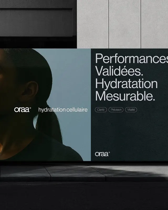
A two-sided product advertisement split between lifestyle imagery and clinical benefit claims, anchored by high-contrast typography.
Summary
A skincare product campaign split across two complementary compositions: lifestyle imagery on the left against muted blue, clinical copy on the right against dark navy, unified by the ORAA logo and sans-serif typography.
Visual description
Left half: close-up of a person's side profile (head/shoulder) against a soft muted blue-grey background, with the ORAA wordmark and product descriptor "hydratation cellulaire" in small sans-serif. Right half: dark navy background with oversized sans-serif headline "Performances Validees. Hydratation Mesurable." in white, followed by three circular pill-shaped benefit badges in outline style (Clarte, Precision, Vitalite). The two halves are divided by a subtle vertical dividing line. Soft directional lighting and neutral skin tones on the left contrast with the stark typography-forward treatment on the right.
Key takeaway
The split-composition strategy pairing human imagery with claims-backed copy without overwhelming. The three small outline badges as a low-key, trustworthy benefit summary. The two distinct background tones (muted cool vs. dark) create hierarchy without competing.
Reuse notes
Works for healthcare, skincare, wellness, or any clinical-benefit product positioning itself as both efficacious and human-centered. Best when the left imagery is genuinely inviting (not staged) and the right copy is specific (validated, measurable). Not suited to playful or luxury-first positioning.
More like this






Keep what you find
A free account saves references to boards and can send you a weekly email of picks based on what you save.
To see every result, go Pro.