Preview image. Unlock full-res
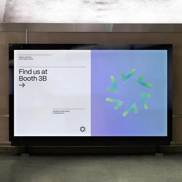
Exhibition booth signage split into minimal type on one side and floating geometric arrows on a blue gradient on the other.
Summary
Exhibition booth signage with a split composition: minimalist typography and navigation instruction on a light background, paired with floating geometric directional arrows on a soft blue-to-blue gradient.
Visual description
Left panel displays "Find us at Booth 3B" in bold sans-serif, followed by a right-pointing arrow. Small baseline text reads "WorkPlace made simple at WeWorkBizcom" with a small icon. Right panel features a periwinkle-to-sky gradient backdrop with roughly six floating geometric arrow shapes in pale yellow-green, suggesting motion and directional intent. The overall composition emphasizes clean typography, generous whitespace, and minimal color palette. Displayed on a large black-bordered screen mounted on a neutral interior wall.
Key takeaway
The split-panel approach separating messaging (left) from visual interest (right); the use of gradient as a focal background; floating geometric shapes creating movement without complexity.
Reuse notes
Effective for exhibition and event signage where you need to combine clear wayfinding with visual sophistication. Works well for modern design conferences, trade shows, or corporate installations where the booth itself is an art piece.
More like this
Keep what you find
A free account saves references to boards and can send you a weekly email of picks based on what you save.
To see every result, go Pro.