Preview image. Unlock full-res
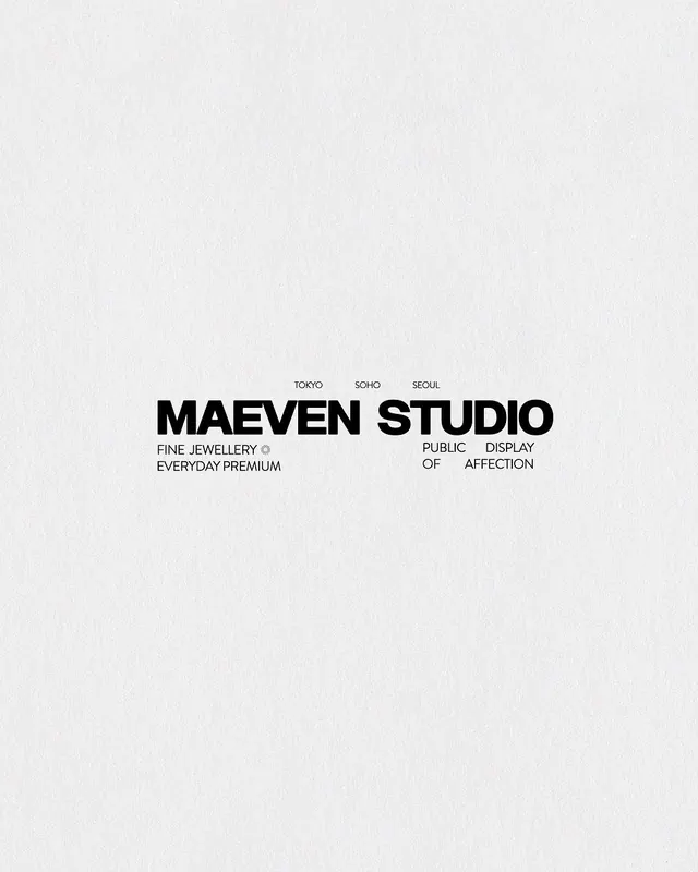
Monochrome brand layout with small location pills above large bold sans-serif wordmark and descriptor lines spanning asymmetrically below.
Summary
Monochrome brand layout with small location pills above large bold sans-serif wordmark and descriptor lines spanning asymmetrically below.
Visual description
Light textured background (possibly linen or cotton stock). Near the top, three small uppercase labels in condensed sans-serif: "TOKYO", "SOHO", "SEOUL", spaced roughly equal distance. Below, the brand wordmark "MAEVEN STUDIO" in large, bold, geometric sans-serif, optically centered. Underneath, four short descriptive lines in much smaller sans-serif set in two columns: left side reads "FINE JEWELLERY", "EVERYDAY PREMIUM", right side "PUBLIC DISPLAY", "OF AFFECTION". A small circular icon appears after "JEWELLERY". Pure black and gray on off-white, no additional color.
Key takeaway
The geographic location tags (three cities) as a quick brand credential, placed above rather than below. The asymmetric splitting of descriptor lines into two columns (service language on the left, brand promise on the right) avoids a centered, stiff look while staying perfectly legible. The scale jump from city tags to wordmark to supporting copy creates clear hierarchy without any actual emphasis marks.
Reuse notes
Smart layout for multi-location luxury or craft brands that want to express both global reach and local presence. The descriptor-line split works especially well for jewelry, fashion, or artisanal goods that pair product category with an emotional or lifestyle promise. The light background + pure black type is minimalist and uncompromising; ensure the typeface has strong personality at the wordmark size to carry the brand's character.
More like this



Keep what you find
A free account saves references to boards and can send you a weekly email of picks based on what you save.
To see every result, go Pro.