Preview image. Unlock full-res
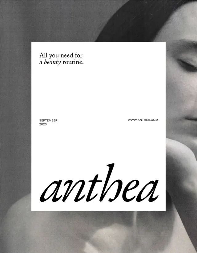
Beauty brand poster with split composition contrasting a photographic face (right) against a minimal text layout on white card (left), anchored by large italic wordmark.
Summary
A two-part beauty brand poster pairing a black-and-white photographic portrait (right) with a minimal white card (left) holding headline, metadata, and italic branding.
Visual description
Right half: grayscale close-up photograph of a face in soft focus. Left half: white card overlaid on the image. Top of card: "All you need for a" in sans-serif, followed by "beauty" in serif italic. Bottom left: "SEPTEMBER 2023" in small sans-serif. Bottom right: "www.anthea.com" in matching sans-serif. Card width is approximately one-third the poster width, creating clear visual hierarchy. Large italic serif "anthea" wordmark spans the bottom, positioned across both card and photograph. Text is small and cleanly spaced; no decorative elements.
Key takeaway
The split of clean typography against atmospheric photography (white space cleanly separates them). The use of a single serif italic accent ("beauty", the wordmark) lifting an otherwise all-sans-serif layout. The restrained date/URL positioning and the way the wordmark bridges both card and image.
Reuse notes
Effective for beauty, wellness, and lifestyle brands targeting premium positioning. Works because the monochrome photo provides all the visual interest, letting typography breathe. Scale the card width based on text volume; works best with short headlines.
More like this

Keep what you find
A free account saves references to boards and can send you a weekly email of picks based on what you save.
To see every result, go Pro.