Preview image. Unlock full-res
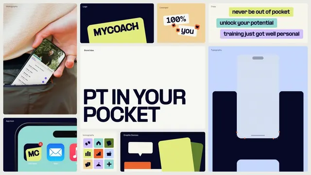
Comprehensive brand identity for MyCoach personal training app, featuring neon lime-yellow taglines, dark navy logo, teal accent, icon library, and photography samples.
Summary
A brand system showcase for MyCoach, a personal training app, displaying neon-bright taglines, dark navy branding, icon library, app interface, and lifestyle photography.
Visual description
A multi-panel system grid shows the MyCoach brand across formats. Top-left: lifestyle photography of a hand holding a phone running the app. Center-top: the dark navy logo on a white square labeled "Logo," with an adjacent "Brand Idea" callout. Upper-right: neon lime-yellow banner with "MYCOACH" in bold sans-serif, plus three additional tagline cards in neon yellow, turquoise, and lavender with motivational copy ("never be out of pocket," "unlock your potential," "training just got well personal"). Lower panels show: the app icon (navy with teal accents), icon set variations in purple, cyan, lime, and orange, app interface mockup with a light blue background and navy elements, and a typography sample grid. The overall palette pairs deep navy with vibrant lime, teal, and pastels, creating high energy and playfulness.
Key takeaway
The pairing of a serious dark navy with multiple neon accents creates personality without chaos. The tagline cards use different colored backgrounds and simple geometric shapes (speech bubble, circles with pupils) to add visual interest. Icon variety across multiple color treatments shows brand flexibility.
Reuse notes
Strong reference for fitness, wellness, and consumer app branding. The neon-plus-navy combination is trendy for Gen-Z focused apps. The multi-format presentation (photography, icons, type, interface) works as a brand guideline template. Apply this energy to coaching, training, or lifestyle app launches.
More like this
Keep what you find
A free account saves references to boards and can send you a weekly email of picks based on what you save.
To see every result, go Pro.