Preview image. Unlock full-res
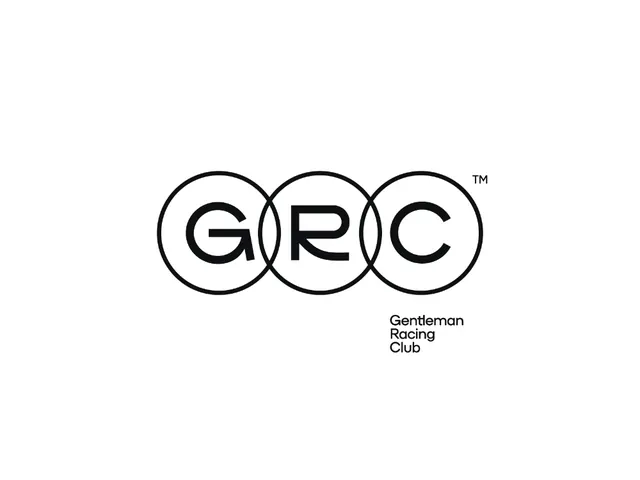
Three overlapping circles form a monogram for GRC with bold sans-serif letters, anchored by stacked tagline text, all in black on white.
Summary
Three overlapping circles form a monogram for GRC with bold sans-serif letters, anchored by stacked tagline text, all in black on white.
Visual description
Three black circles of equal size overlap horizontally, creating lens-shaped intersections at the seams. Each circle contains one letter of the acronym (G, R, C) set in a bold, extended sans-serif. Below the circles, right-aligned, sits the full name "Gentleman Racing Club" in three stacked lines of sans-serif, matching the weight and tone of the letterforms above. The entire composition sits centered on a white field with generous white space around it. A small TM mark appears in the upper right.
Key takeaway
The economy of three simple geometric shapes building a complete brand identity without any additional graphic embellishment. The interlocking negative space between circles creates visual density and cohesion without decoration.
Reuse notes
Strong blueprint for sports clubs, membership organizations, or automotive brands needing a classic, restrained identity. The circle geometry and symmetry read as stable and established. Works equally well at large scales (signage) or small scales (favicon).
More like this






Keep what you find
A free account saves references to boards and can send you a weekly email of picks based on what you save.
To see every result, go Pro.