
Preview image. Unlock full-res
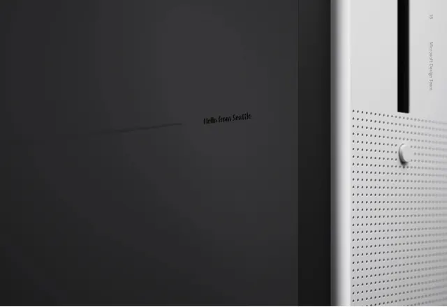
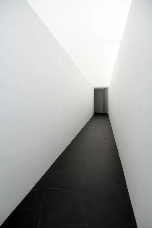
Near-white and dark charcoal split-field composition with minimal middle gray, creating visual clarity through polarity.
Summary
A disciplined two-color composition balancing near-white (#F2F2F2) and deep charcoal (#242424) in roughly equal measure, creating visual equilibrium through contrast.
Visual description
Near-white (#F2F2F2) and dark charcoal (#242424) are divided with minimal gradient or transition. The even split (roughly 59/39) suggests an intentional two-field layout—possibly split-screen, left-right panel, or layered geometric forms. The complete absence of mid-tones emphasizes the clean break between light and dark, typical of minimalist graphic design or architectural visualization.
Key takeaway
Perfect balance through polarity. Neither color dominates oppressively; the split creates composition through color division rather than through detail or decoration. This is restraint as strength.
Reuse notes
Works for contemporary architecture, minimalist branding, or luxury design. Strong for split-layout web design or app interfaces. Pairs beautifully with single accent colors. The soft white (vs. pure white) prevents eye strain while maintaining clarity.
More like this





Keep what you find
A free account saves references to boards and can send you a weekly email of picks based on what you save.
To see every result, go Pro.