Preview image. Unlock full-res
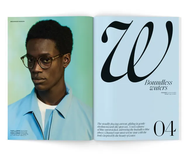
Two-page magazine layout pairing a cool-toned portrait on the left with oversized italic type and body copy on a light blue right page.
Summary
Two-page magazine spread pairing a cool-toned portrait of a young man in glasses on the left with a large italic headline and small body text on a soft blue right page.
Visual description
Left page features a portrait photograph of a young man wearing glasses and a light blue shirt against a teal-to-blue gradient background. Right page has a soft blue background with large black italic type as the main headline, followed by smaller serif body text and a reference number "04" in the bottom right. The layout is symmetrical and uncluttered, using the cool blue palette consistently across both pages. Narrow margins and tight typography create a modern, sophisticated editorial feel.
Key takeaway
The pairing of a single strong portrait with generous negative space and a cool monochromatic palette. The oversized italic headline acts as visual counterpoint to the photography while staying minimal. The use of a single accent color family across both pages creates cohesion.
Reuse notes
Effective for editorial layouts, annual reports, or feature articles. Works especially well when you have a strong subject photograph and want typography to frame rather than compete. The cool blue palette reads as professional and contemporary; swap colors to warm tones for a different mood while keeping the two-column structure.
More like this
Keep what you find
A free account saves references to boards and can send you a weekly email of picks based on what you save.
To see every result, go Pro.