Preview image. Unlock full-res
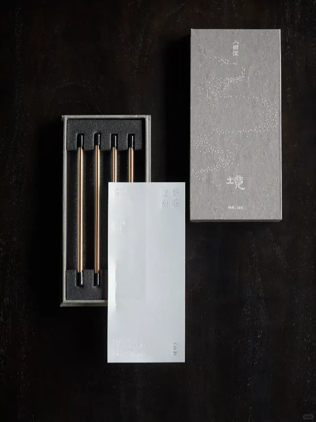
Luxury identity system combining geometric packaging for chopsticks and stationery with matte-black, grey, and metallic-bronze material styling.
Summary
A luxury Japanese stationery and tableware brand identity system presented as a curated flatlay, showcasing packaging and products through carefully controlled material contrast and geometric precision.
Visual description
Flatlay photograph shot overhead against deep charcoal-black background. Left: a geometric container in matte black with inset white framing holds four metallic chopsticks (gold-bronze tones) arrayed vertically in a grid. Center: a white envelope or card bearing subtle embossed East Asian characters. Right: a tall, light-grey textured box with embossed surface pattern and typography. All pieces feature minimal, precisely rendered details. The composition employs extreme contrast between dark and light with warm metallic accents, arranged with mathematical spacing to emphasize material quality and craftsmanship.
Key takeaway
Use material contrast as your primary storytelling device: matte black against brushed silver, warm metals against cool neutrals. Restrict the palette to three or four tones and let texture and finish variations provide visual richness. Geometric, grid-based layouts signal precision and premium positioning. Overhead flatlay photography with dramatic side lighting emphasizes material and form.
Reuse notes
Ideal for luxury goods, Japanese-inspired, or minimalist brand identity systems. The monochromatic warmth reads sophisticated for food, tableware, stationery, or cosmetics brands. Works particularly well in portfolio presentations where craftsmanship and material specification are selling points. Avoid busy patterns; let the form and material be the design.
More like this



Keep what you find
A free account saves references to boards and can send you a weekly email of picks based on what you save.
To see every result, go Pro.