Preview image. Unlock full-res
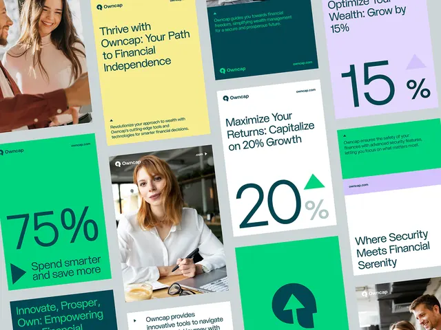
Modular dashboard layout mixing metric callouts, portrait imagery, and data cards in teal, green, and lavender on white.
Summary
A grid-based fintech composition mixing large percentage metrics (75%, 20%, 15%), headshot photography, teal and green accent cards, and lavender typography blocks on a white background.
Visual description
An irregular grid layout on white with eight distinct modules. Top left: woman in brown jacket beside bold "75%" in teal with descriptive text below. Center: "20%" callout in white sans-serif with supporting copy. Top right: lavender card with "15%" heading and icon. Lower sections include teal accent blocks with white body copy, additional portrait photography showing professional subjects, and green highlight cards with data-driven messaging. Typography is clean sans-serif in varying weights, with accent colors (deep teal, bright green, lavender) used for headers and secondary information. Composition balances bold numeric callouts with smaller supporting text and human imagery.
Key takeaway
Large, high-contrast percentage metrics pull focus and immediately communicate growth or financial data. Mixing portrait photography with abstract cards creates approachability in what could otherwise feel sterile. The teal-green-lavender color scheme feels both corporate and modern, avoiding the typical fintech blue monotony. Layered grid structure gives flexibility for varied content types without feeling random.
Reuse notes
Well-suited for fintech landing pages, wealth management marketing, and investment dashboards. The generous white space and mix of imagery and data makes it work for both print and digital. Photography should be professional headshots or lifestyle to maintain the trustworthy tone. Works best on white or very light backgrounds to let the teal and green accents read clearly.
More like this






Keep what you find
A free account saves references to boards and can send you a weekly email of picks based on what you save.
To see every result, go Pro.