Preview image. Unlock full-res
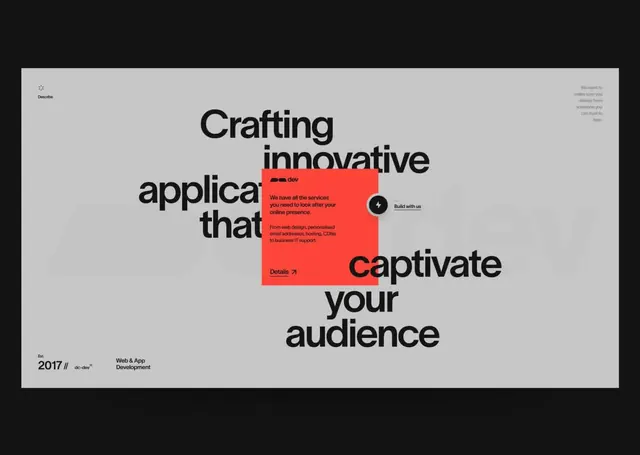
Web agency poster combining bold, stacked type with a bright neon-red overlay box containing CTA copy and buttons.
Summary
A technology agency poster centered on oversized black sans-serif type announcing "Crafting innovative applications that captivate your audience," interrupted by a bright neon-red box containing service copy and action links.
Visual description
The composition spans a light-gray background with a small decorative circle icon in the top left. Dominating the center is chunky, bold, black sans-serif type set in multiple lines and stacked vertically, reading "Crafting innovative applications that captivate your audience." Overlaid midway through this headline is a vivid neon-red rectangular shape (approximately 40% opacity or solid) containing smaller black body copy describing service offerings, a small circular icon labeled "Build with us," and a "Details" link with an arrow. The bottom left carries the agency branding: "2017 //" and the "dc.dev" logo with "Web & App Development" subtitle. The top right contains small secondary text describing the platform's mission. The overall effect is a classic agency poster balancing calming negative space with a bold accent color to drive engagement.
Key takeaway
The strategic use of a bright accent color (neon red) to carve out an interactive zone within typographic hierarchy, without overwhelming the primary message. Stacked oversized type creates rhythm and rhythm and emphasis. Precise button/link placement inside the accent box makes CTAs feel integrated rather than tacked-on. The approach is particularly effective for developer-focused audiences where technical credibility and playfulness coexist.
Reuse notes
Effective for web and app-development agencies, SaaS marketing, and any platform promoting technical services. The neon accent works best as a secondary focal point to complement, not replace, strong typography. Pairs well with clean minimalist layouts and generous white space. Consider when targeting developer and design-conscious audiences who appreciate the balance between playfulness and professionalism.
More like this




Keep what you find
A free account saves references to boards and can send you a weekly email of picks based on what you save.
To see every result, go Pro.