Preview image. Unlock full-res
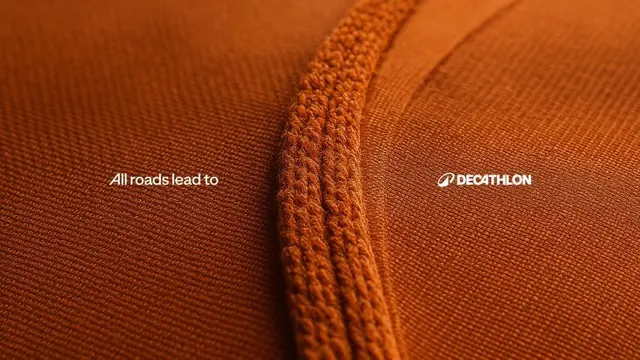
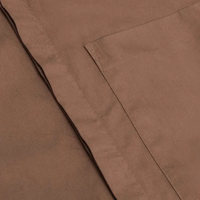
Close-up of warm burnt-orange woven textile with a diagonal seam, overlaid with minimal white sans-serif logotype for Decathlon.
Summary
Close-up of warm burnt-orange woven textile with a diagonal seam, overlaid with minimal white sans-serif logotype for Decathlon.
Visual description
A tight macro shot of heavy-weight knit or woven fabric in deep burnt-orange dominates the frame, showcasing the tactile texture of individual threads and the regular weave pattern. A diagonal seam runs through the center, creating a shadow line that adds depth. The fabric's warm terracotta tone shifts slightly across the frame, suggesting natural light catching the raised fibers. In the top-left, small white serif text reads "All roads lead to"; in the top-right, the white Decathlon logo and brand name appear in clean sans-serif. The minimal typography sits quiet against the detailed surface, letting the material be the hero.
Key takeaway
Using fabric/material texture as a visual anchor for brand identity, anchoring premium quality without needing product mockups or lifestyle staging. The diagonal compositional line created by the seam guides the eye naturally. Typography kept minimal and light ensures readability over detail-rich backgrounds. The color consistency (warm monochrome) makes the material feel unified and intentional.
Reuse notes
Strong for outdoor apparel, sportswear, and textile brands. Works as a hero image or a section divider. Best for brands where material quality is a selling point. The close-up scale reads well on mobile and invites tactile perception. Avoid if the product variety demands hero images showing finished garments or broader lifestyle contexts. The single-fabric approach emphasizes craftsmanship over range.
More like this




Keep what you find
A free account saves references to boards and can send you a weekly email of picks based on what you save.
To see every result, go Pro.