Preview image. Unlock full-res
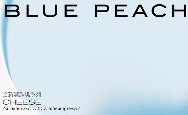
Minimalist skincare packaging using soft blue gradients, sans-serif hierarchy, and ample whitespace to convey natural purity.
Summary
Skincare product label leveraging soft blue vertical gradient, centered hierarchy, and bilingual typography to signal clean, natural efficacy.
Visual description
A vertical rectangle with a subtle top-to-bottom gradient from light blue-gray to deeper cyan-blue. At the top, bold sans-serif all-caps headline "BLUE PEACH" in black. In the lower portion, traditional Chinese characters (product name), then English "CHEESE" in bold, underneath a descriptor "Amino Acid Cleansing Bar" in light sans-serif. The negative space is substantial, with typography floating on the gradient. The layout is centered, emphasizing calm and clarity. Color is restricted to the background gradient and black text.
Key takeaway
Use a directional gradient (vertical or diagonal) as the sole decoration; it eliminates the need for patterns, illustrations, or photography while creating visual sophistication. Combine minimal, high-contrast typography in multiple languages hierarchically. The tonal restraint (one cool-blue gradient plus black text and white space) makes the product category instantly readable.
Reuse notes
Ideal for premium skincare, cosmetics, and wellness products targeting modern, design-conscious consumers. The approach works particularly well when the product benefit is simplicity, purity, or clinical efficacy. The bilingual layout is effective for global markets or heritage brands. Cool gradients signal freshness and cleanliness; would not work as effectively with warm tones for this category.
More like this

Keep what you find
A free account saves references to boards and can send you a weekly email of picks based on what you save.
To see every result, go Pro.