Preview image. Unlock full-res
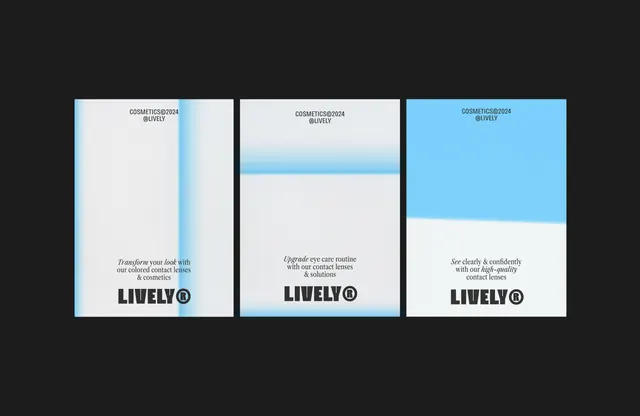
Three vertical product cards for a beauty brand featuring soft blue-to-white gradients and minimalist sans-serif typography.
Summary
Three horizontal-arranged product cards for a cosmetics brand using sky-blue gradients against white and light-gray grounds with product messaging and branding.
Visual description
Three vertical rectangular cards displayed side by side on dark background. Left card: white ground with subtle sky-blue vertical gradient along the left edge; small header text (brand and product line), large copy (product benefit in serif italics), brand mark at bottom. Center card: white ground with prominent sky-blue horizontal gradient band through the middle; similar layout with italicized copy. Right card: sky-blue background with gradient fading to white on the right edge; same header and footer structure with white copy. All cards use consistent sans-serif weight and sizing. Spacing between cards is even.
Key takeaway
Gradient bands used as dividers or accent strokes draw the eye without overwhelming the layout. The alternating light/dark card backgrounds create visual rhythm while maintaining clarity. Pairing serif italics (product benefit) with sans-serif (headers/branding) adds sophistication and hierarchy.
Reuse notes
Ideal for beauty, wellness, or healthcare product showcase where brand credibility and product benefits must coexist. Works well at e-commerce landing page scale or as a mobile carousel. The cool gradient palette reinforces freshness and professional care; avoid if selling warmth or luxury.
More like this




Keep what you find
A free account saves references to boards and can send you a weekly email of picks based on what you save.
To see every result, go Pro.