Preview image. Unlock full-res
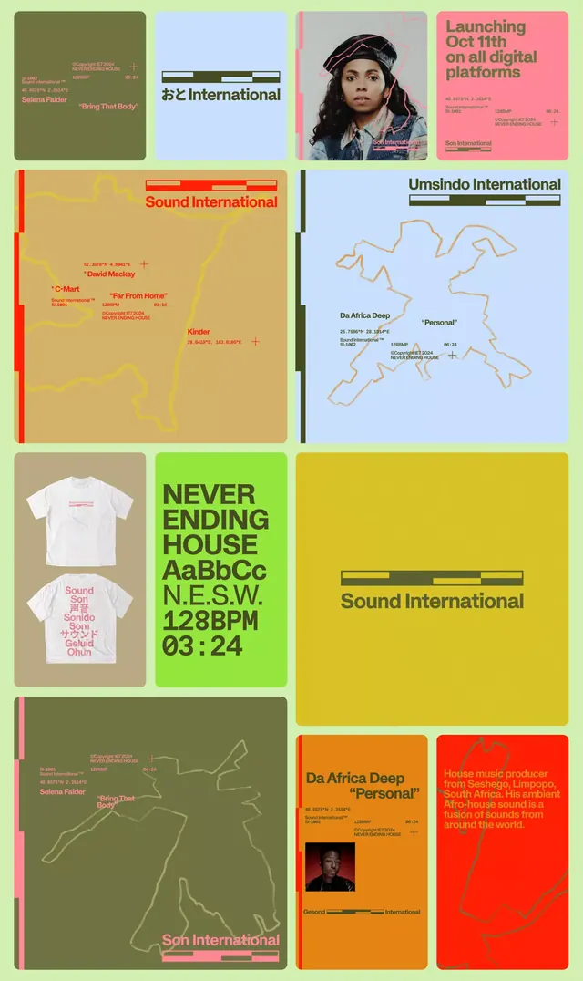
A multi-panel design system collage for international electronic music labels, combining album artwork, merchandise, and geographic maps in saturated color blocks.
Summary
A multi-panel design system collage showcasing identity work for international electronic music labels, layering album covers, merchandise, and geographic elements across a grid.
Visual description
Irregular grid of colored rectangles and rounded-corner cards. Upper panels: olive-green and light blue backgrounds with label names and artist credits. Bright pink panel with portrait photo and release announcement. Middle: large beige rectangle with yellow map outlines and "Sound International" nameplate in red; light blue panel with tan map shapes and "Umsindo International" text in dark olive. Below: two white t-shirts with pink/red text overlay; bright green tall panel with "NEVER ENDING HOUSE" in display type and typography specimens. Bottom row: dark olive-green card with pink accent stripe and outline map; burnt-orange panel with portrait and "Da Africa Deep" label; red panel with tan line map. All panels use sans-serif, all-caps headlines in black or dark tones.
Key takeaway
Color blocking in saturated, contrasting hues creates visual rhythm without ornament. Integrating typography specimens, merchandise mockups, and map illustrations into the grid demonstrates a cohesive visual system across media. The outline-map motif becomes a recurring symbol tying disparate labels together.
Reuse notes
Ideal for music labels, artist collectives, or event promoters wanting modular, printable identity systems. The bold color palette and display typography work well on social media, posters, and merchandise. The grid layout scales to different sizes. Geography element is memorable for international/world-music positioning.
More like this

Keep what you find
A free account saves references to boards and can send you a weekly email of picks based on what you save.
To see every result, go Pro.