Preview image. Unlock full-res
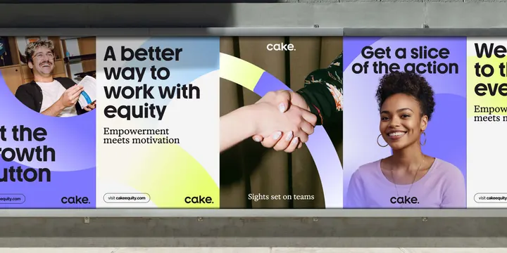
Three-panel corporate infographic using bold sans-serif headings, human photography, and alternating purple-and-yellow color blocks to communicate HR messaging around equity, empowerment, and teams.
Summary
Three-panel corporate infographic using bold sans-serif headings, human photography, and alternating purple-and-yellow color blocks to communicate HR messaging around equity, empowerment, and teams.
Visual description
The layout divides into three distinct vertical sections, each pairing a full-width photograph or graphic with a typography and color layer. The first panel shows a man in casual office dress with overlay text "A better way to work with equity" in bold black sans-serif on a light background, paired with a yellow diagonal shape. The second panel is a close-up photograph of a handshake shot from above, with "Sights set on teams" centered in white serif or display type. The third panel features a woman smiling against a purple background with white text reading "Get a slice of the action" and a yellow diagonal accent. Throughout, color blocks of purple and yellow alternate to create rhythm and visual separation between panels. The overall composition is horizontal, with typography scaled at display size for maximum impact.
Key takeaway
The use of large, contrasting colored shapes (purple and yellow diagonals) as a visual system that separates and unifies panels. The pairing of professional photography with bold, oversized headlines in monochromatic type against colored backdrops, creating strong figure-ground separation and readability. The horizontal rhythm of three distinct messaging moments tied together by a consistent color and typography language.
Reuse notes
Strong for HR, talent acquisition, or corporate internal communications. The vertical panel structure works well for event promotions, product launches, or multi-benefit messaging where each "chapter" gets its own visual hierarchy. The photography-plus-bold-type formula is approachable and earnest, suited to audiences seeking a friendly-but-professional tone. The purple-yellow palette is distinctive; if replicating, ensure enough contrast against the photography or backgrounds.
More like this


Keep what you find
A free account saves references to boards and can send you a weekly email of picks based on what you save.
To see every result, go Pro.