Preview image. Unlock full-res
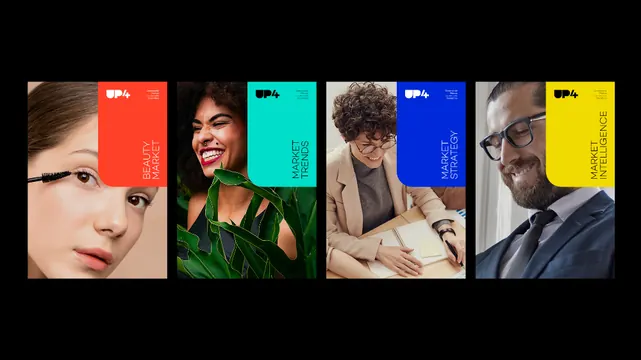
Four portrait photographs arranged horizontally, each paired with a solid color overlay in red, cyan, blue, or yellow, and a white brand logo and text.
Summary
Four professional headshots arranged in a horizontal strip, each with a bold solid-color overlay (red, cyan, blue, yellow) and the UP4 white logo positioned in the top corner.
Visual description
A horizontal composition of four portraits divided by thin black lines. Each portrait is a close-up photograph of a person in professional attire or styling, paired with a large colored rectangle filling the right half of its tile. The colors are flat, saturated primaries and secondary hues: a warm coral red, a bright cyan/aqua, a cobalt blue, and a vibrant yellow. The UP4 logo appears in white sans-serif at the top right of each colored block. The entire composition sits against a pure black background with no padding.
Key takeaway
The bold solid-color pairing against tonal photography creates immediate visual contrast without fighting the facial subjects. The limited color palette (four distinct, confident hues) combined with the clean, repetitive grid establishes a cohesive brand system that feels modern and confident. The asymmetry of photo-to-color placement forces the eye across the composition.
Reuse notes
Effective for corporate, agency, or B2B branding where diversity and energy matter equally. Works best when subject matter (portraits, team) genuinely justifies each tile; avoid pure repetition. The dark background keeps colors vibrant; lighter backgrounds would weaken the effect. Scale well to social cards or presentation headers.
More like this







Keep what you find
A free account saves references to boards and can send you a weekly email of picks based on what you save.
To see every result, go Pro.