Preview image. Unlock full-res
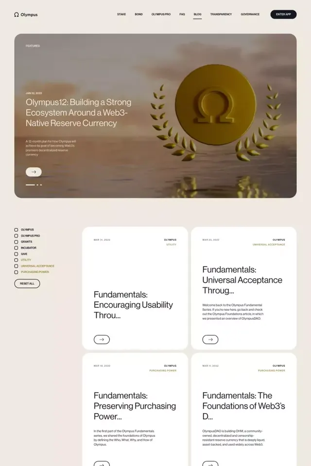
An elegant fintech website design combining muted beige, warm grays, and a bold gold circular element, paired with minimal sans-serif typography and structured card-based content layout.
Summary
An elegant fintech website design combining muted beige, warm grays, and a bold gold circular element, paired with minimal sans-serif typography and structured card-based content layout.
Visual description
A multi-section website layout shown in full-page preview. Top section features a large hero with muted taupe background, containing a prominent gold/olive circle on the right side, small green leaf illustrations in opposite corners, and headline text in clean sans-serif. Navigation bar sits at top in dark gray with pill-shaped button in black. Below hero: a section with left-aligned list items in minimal sans-serif, followed by a grid of white cards arranged in two columns, each containing a small illustration or icon, a paragraph heading beginning with "Fundamentals:" (e.g., "Encouraging Usability Through..."), and body text. Ample white space separates sections. Throughout: muted color palette of cream, taupe, muted brown, gold, and black text.
Key takeaway
The restrained color palette (only 4-5 hues, mostly neutrals plus one metallic accent) creates sophisticated trust. The gold circle used sparingly and paired with organic leaf motifs softens corporate minimalism. The card grid with consistent spacing and quiet typography hierarchy is readable and premium. The hero image treatment (large decorative shape + foliage) feels modern without being trendy.
Reuse notes
Ideal for fintech, wealth management, and high-end SaaS platforms. The muted palette and generous whitespace suggest trustworthiness and stability. Best paired with clear, regulatory-compliant copywriting. Works particularly well on desktop but requires careful spacing adaptation for mobile.
More like this



Keep what you find
A free account saves references to boards and can send you a weekly email of picks based on what you save.
To see every result, go Pro.