Preview image. Unlock full-res
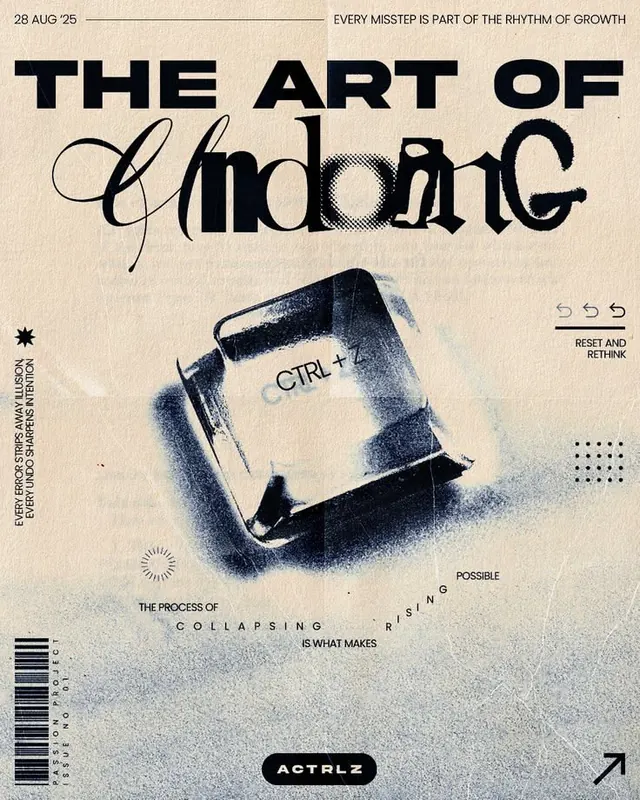
Editorial poster combining bold sans-serif headlines with handwritten script overlay and layered halftone texture on cream background.
Summary
Editorial poster combining an oversized all-caps sans-serif headline with a large flowing script word layered on top, anchored by textured halftone imagery and dense typographic details on a cream background.
Visual description
A vertical poster on a cream-textured ground with a date banner at top ("28 AUG '25" / "EVERY MISSTEP IS PART OF THE RHYTHM OF GROWTH"). Bold, heavy sans-serif type sets "THE ART OF" in full capitals; beneath it, a large italic handwritten script word "ndoing" floats over the sans-serif baseline, breaking the grid. A halftone image of what appears to be a hand or abstract tactile form sits center-right, rendered in grayscale with visible halftone dots. Surrounding the composition are smaller type elements, including a keyboard iconography on the left spine, a circular icon with concentric lines, dotted circular patterns, and scattered text fragments ("CTRL +", "RESET AND RETURN", "THE PROCESS OF COLLAPSING IS WHAT MAKES POSSIBLE RISING", "ACTBLZ" logotype). The palette is cool grays and blacks against the warm cream, with the halftone providing textural contrast.
Key takeaway
The layering of script over sans-serif creates typographic tension and visual interest without decoration. The halftone texture grounds the piece in physicality. The surrounding micro-typography and icons act as secondary information that does not compete with the headline hierarchy.
Reuse notes
Effective for posters, editorial covers, and conceptual design that wants to communicate both principle (the main headline) and process (the halftone imagery + supporting type). Works best when the handwritten script echoes or completes a sans-serif headline. The cream background and monochromatic palette give it a historical, letterpress feel suitable for design-focused brands or cultural institutions.
More like this


Keep what you find
A free account saves references to boards and can send you a weekly email of picks based on what you save.
To see every result, go Pro.