Preview image. Unlock full-res
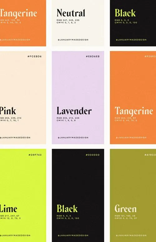
A 3x3 grid of minimalist color cards showing large type names and small RGB/CMYK specs.
Summary
A 3x3 grid of minimalist color cards showing large type names and small RGB/CMYK specs.
Visual description
The image shows nine square poster-like cards arranged in a 3-by-3 grid. Each card uses a different solid or softly textured background color with a large serif color name and small RGB and CMYK values beneath it.
Key takeaway
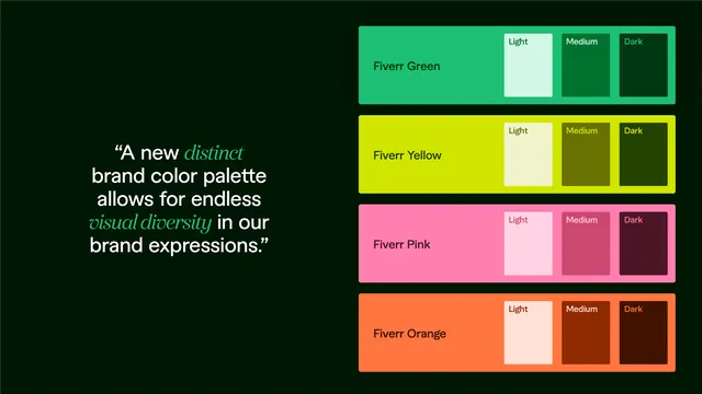
Use a rigid grid of isolated color cards with oversized serif naming and tiny technical specs to make a palette feel editorial and premium. The strong contrast between light and dark cards gives the set rhythm without adding extra decoration.
Reuse notes
Reach for this when presenting brand colors, material palettes, or type-color studies that need to feel curated rather than functional. It works best when the content is simple and the layout itself needs to carry the visual interest.