Preview image. Unlock full-res
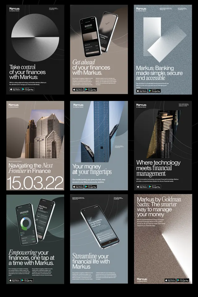
A grid of monochrome poster advertisements for Marcus by Goldman Sachs combines large typography, abstract geometric shapes, and mobile app mockups.
Summary
A grid of monochrome poster advertisements for Marcus by Goldman Sachs combines large typography, abstract geometric shapes, and mobile app mockups.
Visual description
The image shows a 3-by-3 grid of poster layouts for Marcus by Goldman Sachs, each with a different composition, color treatment, and headline. Several panels feature large circles, angled paper-like forms, phone renders, and building photography layered over dark, beige, blue-gray, and textured backgrounds.
Key takeaway
Use one strong geometric hero shape per poster and pair it with a restrained headline block to create instant hierarchy. Mixing serif display type with clean sans-serif supporting copy gives the series a premium finance-editorial feel.
Reuse notes
Reach for this when you need a finance or tech campaign that should feel elevated, minimal, and ad-ready across multiple variants. It works best when the core message can be repeated through a consistent grid while swapping the hero image or abstract motif.