Preview image. Unlock full-res
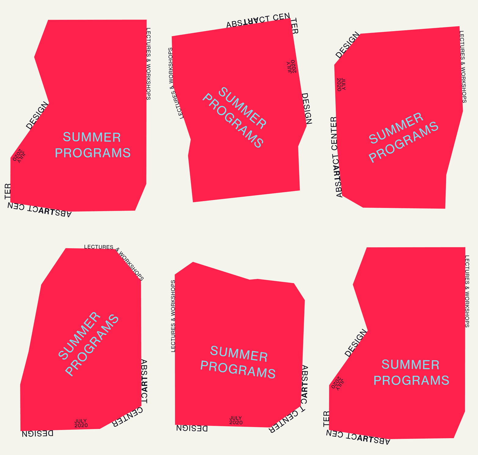
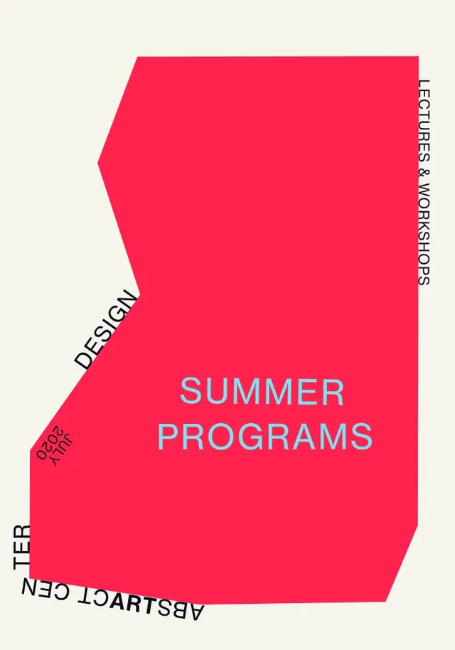
Education poster announcing summer programs with a neon-pink irregular polygon as the primary compositional element and cyan sans-serif headline.
Summary
Education poster featuring a large neon-pink geometric shape dominating the composition with "SUMMER PROGRAMS" in bright cyan type at center, surrounded by rotated descriptive text on all edges.
Visual description
Off-white background. A large irregular polygon in hot neon pink (approximately a tilted rectangle with beveled left edge) occupies the right and center of the composition. Inside the pink shape, the words "SUMMER PROGRAMS" are set in all-caps, bright cyan sans-serif, medium weight, centered at optical center. Around the perimeter on the cream background, rotated text reads "LECTURES & WORKSHOPS" (right edge, vertical), "DESIGN" (left edge, diagonal), "2026 ARTIST" (bottom-left, diagonal), and "SEMESTER" (bottom edge, rotated). Typography throughout is geometric, clean sans-serif in black and dark gray. The contrast between the raw neon pink and muted off-white creates visual punch; the cyan headline amplifies the energy.
Key takeaway
Asymmetric composition driven by a single bold geometric form that breaks the expected rectangle, creating dynamic movement without illustration or photography. The duotone color strategy (neon + cyan against neutral) is economical but arresting. Text rotation around the perimeter is unconventional in modern design but signals experimental, arts-adjacent programming. The large, irregular pink polygon acts as both background and frame, drawing the eye immediately.
Reuse notes
Ideal for arts or design education announcements, experimental workshops, or programs that want to signal creativity and boldness. Works best when the institution or program genuinely embraces non-traditional aesthetics; the strong geometric language feels out of place in conservative academic settings. The color combination has high visibility and works at small scale (social media, email). Only works when headline text (like "SUMMER PROGRAMS") is short and clear; longer copy would clash with the graphic dynamism.
More like this

Keep what you find
A free account saves references to boards and can send you a weekly email of picks based on what you save.
To see every result, go Pro.