Preview image. Unlock full-res
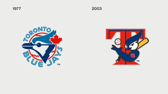
A side-by-side comparison of the Toronto Blue Jays baseball team logos from 1977 and 2003.
Summary
A side-by-side comparison of the Toronto Blue Jays baseball team logos from 1977 and 2003.
Visual description
The image shows two logos on a white background. The 1977 logo features a blue bird with a red maple leaf and 'TORONTO BLUE JAYS' in blue text. The 2003 logo features a stylized blue jay head inside a red and blue 'T' shape.
Key takeaway
The design shows a transition from a literal bird illustration to a more stylized, compact emblem.
Reuse notes
Can be used as a reference for sports branding evolution or logo simplification.
More like this







Keep what you find
A free account saves references to boards and can send you a weekly email of picks based on what you save.
To see every result, go Pro.