Preview image. Unlock full-res
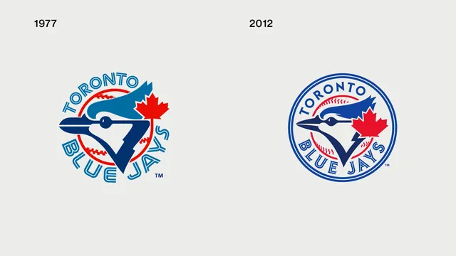
A side-by-side comparison of the Toronto Blue Jays baseball team logo from 1977 and 2012.
Summary
A side-by-side comparison of the Toronto Blue Jays baseball team logo from 1977 and 2012.
Visual description
The image shows two versions of the Toronto Blue Jays logo. The 1977 version features a blue bird with a red maple leaf and 'TORONTO BLUE JAYS' in a stylized font, while the 2012 version is contained within a blue circle with a more modern, streamlined bird and maple leaf.
Key takeaway
The evolution shows a transition from a free-form logo to a more contained, circular emblem with modernized linework.
Reuse notes
Can be used for sports branding analysis or historical design presentations.
More like this





Keep what you find
A free account saves references to boards and can send you a weekly email of picks based on what you save.
To see every result, go Pro.