Preview image. Unlock full-res
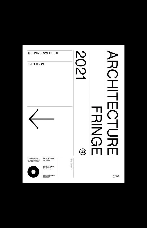
Minimalist exhibition poster combining left-aligned horizontal text, centered vertical type, and a rotated right-aligned block in strict monochrome.
Summary
A minimalist architectural exhibition poster combining horizontal and vertical type blocks in black, white, and grey with a single navigation arrow and circular mark.
Visual description
The poster divides into three text zones: upper-left label text ("THE WINDOW EFFECT / EXHIBITION") in regular weight sans-serif, center-right vertical type spelling "2021 ARCHITECTURE FRINGE" in bold condensed caps, and lower-left a geometric left-pointing arrow. A centered circular monochromatic symbol anchors the bottom left. Footer details run in small caps. The composition relies entirely on sans-serif geometry and negative space, with white serving as the dominant ground and precise black letterforms creating stark contrast. The asymmetric placement of type blocks and the single vertical column read as structured yet dynamic.
Key takeaway
The discipline of using only two colors and three type sizes to create visual hierarchy and rhythm. The left-pointing arrow as a simple navigation element. The placement of type at different angles (horizontal and vertical) to guide the eye through the poster without decorative imagery.
Reuse notes
Effective for exhibition announcements, design talks, or academic events where credibility and precision matter more than warmth. The vertical type block takes up significant space, so works best when the event or topic deserves formal, architectural presentation. Pairs well with minimal color treatments and abundance of white space.
More like this




Keep what you find
A free account saves references to boards and can send you a weekly email of picks based on what you save.
To see every result, go Pro.