Preview image. Unlock full-res
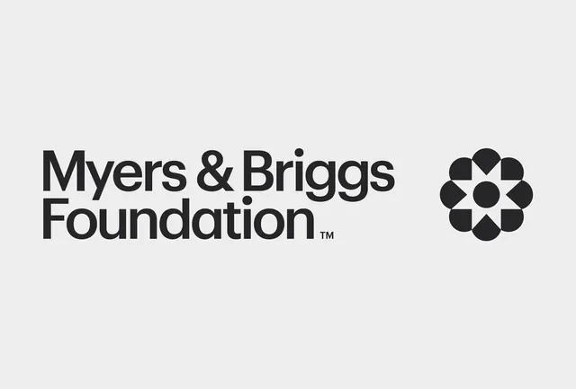
An organization logo pairing a bold sans-serif wordmark with a geometric circular seal made of eight pie-slice segments.
Summary
An organization logo pairing bold sans-serif type with a circular geometric seal composed of eight interlocking pie-slice segments.
Visual description
Two-part horizontal composition. On the left, "Myers & Briggs Foundation" is set in a heavy, industrial sans-serif with tight letter-spacing, followed by a small superscript trademark symbol. On the right sits a filled circular mark made of eight equal pie-slice segments (alternating filled and transparent) arranged in a radial pattern, creating a mandala or flower-like appearance. The entire mark is solid black on a light gray background. The overall proportion is wide and stable, with the wordmark occupying roughly two-thirds and the seal one-third.
Key takeaway
The geometric seal as a standalone reinforcement of institutional authority: eight segments create visual rhythm and memorability without literal representation. The heavy sans-serif chosen for its weight and legibility at any scale, paired with restrained negative space. The seal's perfect symmetry conveys precision and established trust, ideal for nonprofits, research organizations, and certified bodies.
Reuse notes
Excellent reference for foundations, nonprofits, educational institutions, and professional certifiers where visual authority and stability matter. The geometric seal can work standalone or with the wordmark, offering flexibility. The heavy monochromatic approach works well for print and digital applications and reproduces cleanly at small sizes.
More like this


Keep what you find
A free account saves references to boards and can send you a weekly email of picks based on what you save.
To see every result, go Pro.