Preview image. Unlock full-res
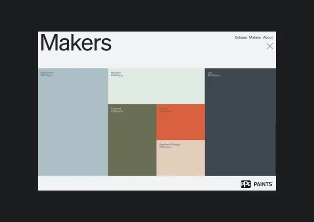
Material design palette grid displaying named paint colors in a structured card layout with branded footer.
Summary
A product color-palette grid showcasing named paint swatches in a clean, hierarchical layout with navigation tabs and a branded footer.
Visual description
A large card interface titled "Makers" with three navigation tabs (Colours, Makers, About) and a close button top-right. The main content is a structured grid of paint color swatches, each labeled with a product name and brand (e.g., "Blue Smoke" and "Mr Robin" from PPG Paints). Six color blocks occupy the center: soft blue-gray, pale cream, muted olive-khaki, warm terracotta-orange, pale peach, and dark slate-gray. Each swatch is a distinct rectangle with its label layered below. The footer carries the PPG Paints logo centered. The overall background is off-white, maximizing the visibility of muted, earthy tones. Typography is clean, modern sans-serif in charcoal gray.
Key takeaway
The hierarchical card structure that frames product information. The balance of negative space around color blocks, letting each swatch breathe. The subtle labeling (name + brand) that gives context without cluttering the visual priority.
Reuse notes
Excellent template for paint, cosmetics, or fabric product galleries. Works well for B2B design-system documentation and interior-design mood boards. The modal card format allows for easy comparison; the Makers/Colours/About taxonomy is typical for branded material systems. Muted, earthy palette appeals to home-goods and heritage-brand contexts.
More like this



Keep what you find
A free account saves references to boards and can send you a weekly email of picks based on what you save.
To see every result, go Pro.