Preview image. Unlock full-res
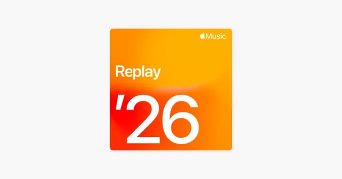
Apple Music's annual Replay promotional card with vibrant orange-to-yellow gradient background, white sans-serif typography, and rounded corners.
Summary
Limited-edition Apple Music Replay seasonal card featuring a smooth orange-to-yellow gradient field, bold white sans-serif numerals, and the Apple Music logo in the top corner.
Visual description
Rounded-corner rectangular card on a light neutral background. Top corner carries the white Apple Music logo mark. Large white sans-serif "Replay" label sits above oversized white numerals "26" (roughly 200px tall) positioned in the left-center. Gradient background transitions smoothly from deep orange on the left side to golden yellow on the right. No additional imagery or decorative elements, design relies entirely on color momentum and typographic hierarchy.
Key takeaway
The gradient-to-typography strategy: a single smooth color gradient (orange-to-yellow) provides movement and warmth without needing photography or icons. Large, bold numerals paired with a small label create clear visual hierarchy. Playful but restrained: no extra ornament, just color and type. Apple Music's seasonal campaigns prove this approach works repeatedly for consumer-facing content.
Reuse notes
Strong template for limited-edition, seasonal, or annual consumer products (Spotify Wrapped, year-end reviews, streaming milestones). The bright gradient reads well on mobile and social media. Works best with one or two typography sizes to maintain the visual simplicity. Apple's success with this format across multiple years suggests the pattern translates across consumer entertainment brands.
More like this





Keep what you find
A free account saves references to boards and can send you a weekly email of picks based on what you save.
To see every result, go Pro.