Preview image. Unlock full-res
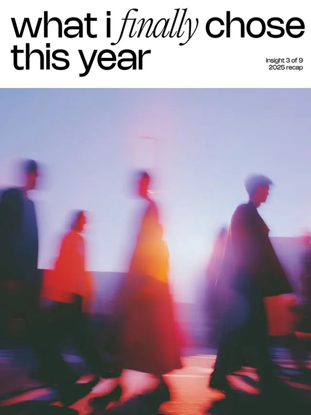
Poster composition layering bold typographic headline over abstracted, gradient-rendered human silhouettes in soft motion blur.
Summary
An editorial poster layering oversized sans-serif type over four blurred human silhouettes rendered in overlapping gradient overlays of blue, red, orange, and pink tones.
Visual description
The headline in large black sans-serif with italic accent reads "what i finally chose this year" with a small right-aligned subtitle. Below sits a composition of four abstracted, motion-blurred human figures shown in profile and frontal views. Each silhouette is filled with a different vibrant gradient (indigo to purple, red to orange, pink) and positioned at overlapping intervals, creating visual depth. The background is a soft, nearly monochromatic pastel (pale lavender-blue), which recedes behind the energetic foreground figures. The overall effect is dreamlike and introspective despite the energetic color palette.
Key takeaway
The gradient-fill treatment of figures as a way to abstract portraiture while maintaining silhouette legibility. The overlapping stagger of elements suggests movement and complexity. Color differentiation between each figure reads as distinction despite their formal similarity.
Reuse notes
Effective for editorial spreads, year-in-review narratives, or introspective brand messaging. Works best when figures are varied enough (pose, angle) to read as a group despite uniform gradient treatment. Pairs well with extended serif/italic type for contemplative or personal storytelling.
More like this




Keep what you find
A free account saves references to boards and can send you a weekly email of picks based on what you save.
To see every result, go Pro.