Preview image. Unlock full-res
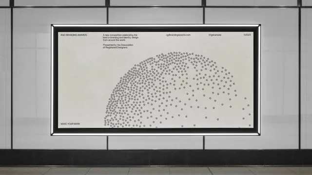
Institutional award poster using dense, repetitive dot patterns to form an abstract curved shape against monochrome typography.
Summary
Institutional award poster using dense, repetitive dot patterns to form an abstract curved shape against monochrome typography.
Visual description
A white poster with black border mounted on a gridded wall. The composition is split horizontally: the upper section contains tight, justified typography (event title, subtitle, URL, credited organization) in a compact sans-serif; the lower section is dominated by hundreds of small circles arranged in a curved cloud or wave form that grows denser on the left and disperses toward the right edge. The negative space is generous and clean. The entire palette is pure monochrome: black type, white ground, grey dots.
Key takeaway
Using a parametric dot cloud to create organic, flowing contrast against rigid typography. The density gradient in the dot pattern suggests motion and hierarchy without using color. Pairing minimal sans-serif with generous white space and a single geometric accent.
Reuse notes
Ideal for academic, institutional, or professional service brands that need sophistication without ornamentation. Effective for awards, conferences, design competitions, and modern governance. The poster format and framed presentation reinforce prestige. Works best with disciplined typography and negative space; avoid cluttering with imagery or additional color.
More like this



Keep what you find
A free account saves references to boards and can send you a weekly email of picks based on what you save.
To see every result, go Pro.