Preview image. Unlock full-res
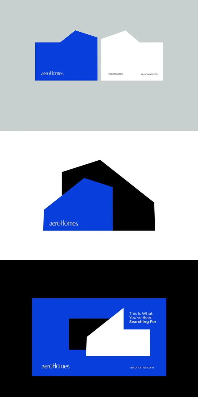
Real-estate brand identity using bold blue and white geometric cutouts, offset layouts, and modular envelope-style card designs.
Summary
Real-estate brand identity featuring Royal blue, white, and black geometric shapes on envelope and card formats, with shifted angular layouts suggesting movement and stability.
Visual description
Three stationery items show a cohesive geometric system. Top: a business card with a white envelope-shaped flap overlay on blue background, with aeroHomes wordmark in white sans-serif and contact details on white flap. Middle: a hexagonal composition pairing a blue geometric house-like shape against a black rotated square, creating a dynamic tilt. Bottom: a landscape card on black ground with a bold blue rectangle containing a white inverted V or arrow shape, aeroHomes text at bottom left, and message text in white on the right ("This Is What You've Been Searching For"). All use sharp, clean edges and flush colors with no gradients or texture.
Key takeaway
The modular use of a single geometric vocabulary (squares, rectangles, angular cutouts) across print formats; the contrast between blue and black backgrounds as a way to add variety without expanding the palette; how the house-like or arrow shapes suggest the brand category (real estate) without literal illustration.
Reuse notes
Excellent reference for corporate identity systems, especially real-estate, fintech, or tech brands targeting professionals. The stationery-focused execution shows how the same logo and color system adapts across business cards, envelopes, and promotional cards. The cool, high-contrast palette suggests confidence and clarity; use it for B2B or institutional work.
More like this







Keep what you find
A free account saves references to boards and can send you a weekly email of picks based on what you save.
To see every result, go Pro.