Preview image. Unlock full-res
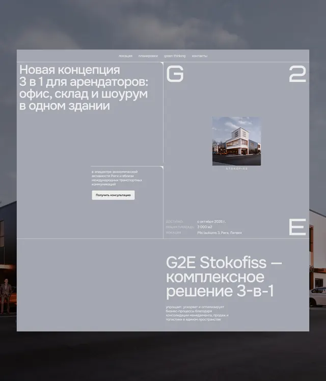
Asymmetric layout for a Russian commercial real estate platform (Stokofiss), uniting office/warehouse/storage via oversized sans-serif headers and a centered building photograph over muted gray.
Summary
A minimal commercial real estate promotional layout for G2E Stokofiss (a 3-in-1 property solution) using an asymmetric grid, large numbered sections, and muted gray tones anchored by a centered warm-lit building photograph.
Visual description
Muted gray background split into numbered rectangular zones (G, 2, E segments) using bold geometric divisions. Oversized sans-serif headline in white type declares the value proposition in Russian ("Новая концепция 3 в 1..."). A smaller supporting photo of an industrial warehouse building with warm wood tones sits centered mid-composition. Fine-detail body text and a button appear lower left. The palette is strictly monochromatic grays with high contrast between light and dark zones, creating a corporate, structured feel. No color, no imagery beyond the single building photo, strong use of whitespace to amplify hierarchy.
Key takeaway
The numbered-zone layout strategy: breaking a complex offering into distinct zones (visually separated by bold lines/contrasts) makes multiple value props legible at a glance. The centered hero photo treatment (unframed, slightly inset) adds warmth to an otherwise severe palette. Oversized sans-serif headers create immediate visual impact even on a gray canvas.
Reuse notes
Strong template for B2B real-estate, storage, or commercial property platforms where you need to communicate multiple service tiers. Works best with a single architectural photograph as anchor. Maintain the minimal palette to avoid weakening the grid structure; this is structure-first design.
More like this


Keep what you find
A free account saves references to boards and can send you a weekly email of picks based on what you save.
To see every result, go Pro.