Preview image. Unlock full-res
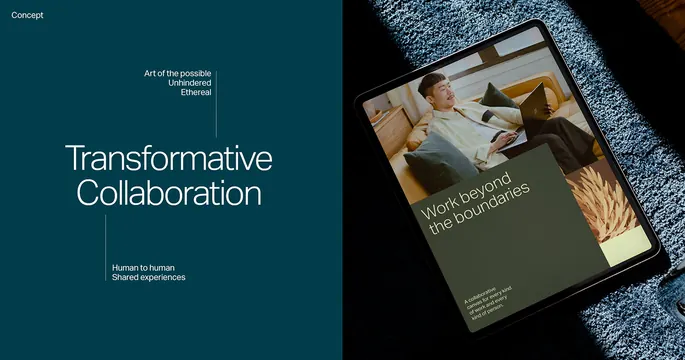
Editorial design spread using a deep teal left panel with white sans-serif headline and a right panel showing a magazine mockup with product photography and layered textures.
Summary
An asymmetric editorial spread with a deep teal left panel reading "Transformative Collaboration" and a right panel showing a printed magazine mockup layered atop textured fabric.
Visual description
The left half is a solid deep teal (nearly black-teal, #013C4A or similar), with white sans-serif sans-serif text reading "Transformative Collaboration" in large all-caps, stacked across lines, occupying roughly one-third of the panel's height. Small subtext below in a lighter sans-serif states "Connect. Accelerate. Impact." and possibly a call-to-action. The right half shows a physical magazine or publication mockup tilted at a slight angle, overlaid atop what appears to be woven linen or knit fabric in cream and gray. The magazine itself displays a product photograph (appears to be a book or branded object) and supporting typography in the same cool teal and neutral palette. The overall composition emphasizes asymmetry and depth via the physical mockup, anchored by the bold typographic statement on the left.
Key takeaway
The split of bold, flat typography (left) against a tangible, layered composition (right) creates visual interest and hierarchy without complexity. The deep teal is sophisticated and distinct from typical corporate blue. Using a physical product mockup on one side and pure type on the other suggests both conceptual thinking and real-world application, useful for consulting, publishing, or technology brands.
Reuse notes
Strong for B2B marketing decks, case-study presentations, or editorial systems where a brand needs to communicate innovation paired with substance. The teal palette works well for tech, consulting, or media. Reserve this layout for single headlines or brief messaging; too much body copy will break the minimalist impact. The fabric/texture element grounds an otherwise digital aesthetic, making it particularly effective in print or high-end digital publishing contexts.
More like this




Keep what you find
A free account saves references to boards and can send you a weekly email of picks based on what you save.
To see every result, go Pro.