Preview image. Unlock full-res
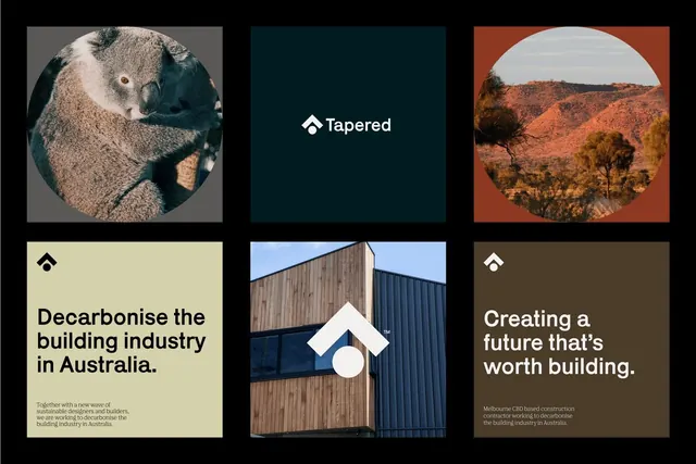
A six-panel brand identity system for Tapered, a construction sustainability firm, mixing photographic circles, architectural imagery, earthy tones (cream, teal, rust), and a geometric logo mark.
Summary
A six-panel brand identity moodboard for Tapered, a Melbourne-based construction contractor specializing in building-industry decarbonization, using photographic imagery, geometric logo variations, and an earthy color palette of cream, teal, rust, and dark brown.
Visual description
Black background framing a 3x2 grid of color-blocked panels. Top-left: koala close-up in a gray square frame. Top-center: solid deep teal square with white geometric logo mark (house shape with circle accent) and centered "Tapered" wordmark in white sans-serif. Top-right: landscape photograph in a rust-orange frame showing low scrub hills and sparse trees under clear sky. Bottom-left: cream background with large sans-serif headline "Decarbonise the building industry in Australia" followed by three lines of body text describing sustainable design and builder collaboration. Bottom-center: architectural photograph of modern building with mixed wood and metal cladding, white geometric logo and accent circle overlaid center. Bottom-right: dark brown background with white sans-serif headline "Creating a future that's worth building" and small body text referencing Melbourne CBD construction efforts. All text is sans-serif except implied serif detail in small print. Color blocking alternates textures: solid colors, photography, with consistent geometric logo treatment across panels.
Key takeaway
The use of circular photographic crops to humanize and ground the brand (koala, landscape); the geometric logo system that reads consistently at small and large scales; the alternating color blocks (cream, teal, rust, brown) that create visual rhythm while maintaining a cohesive earthy, professional mood; juxtaposition of hero photography with solid color blocks for balance.
Reuse notes
Ideal for B2B or construction-industry brands seeking a grounded, sustainable identity. The earthy palette and environmental imagery signal environmental responsibility; works especially well for firms in real-estate, construction, sustainability consulting, or architecture. The modular grid allows flexible application across print and digital.
More like this





Keep what you find
A free account saves references to boards and can send you a weekly email of picks based on what you save.
To see every result, go Pro.