Preview image. Unlock full-res
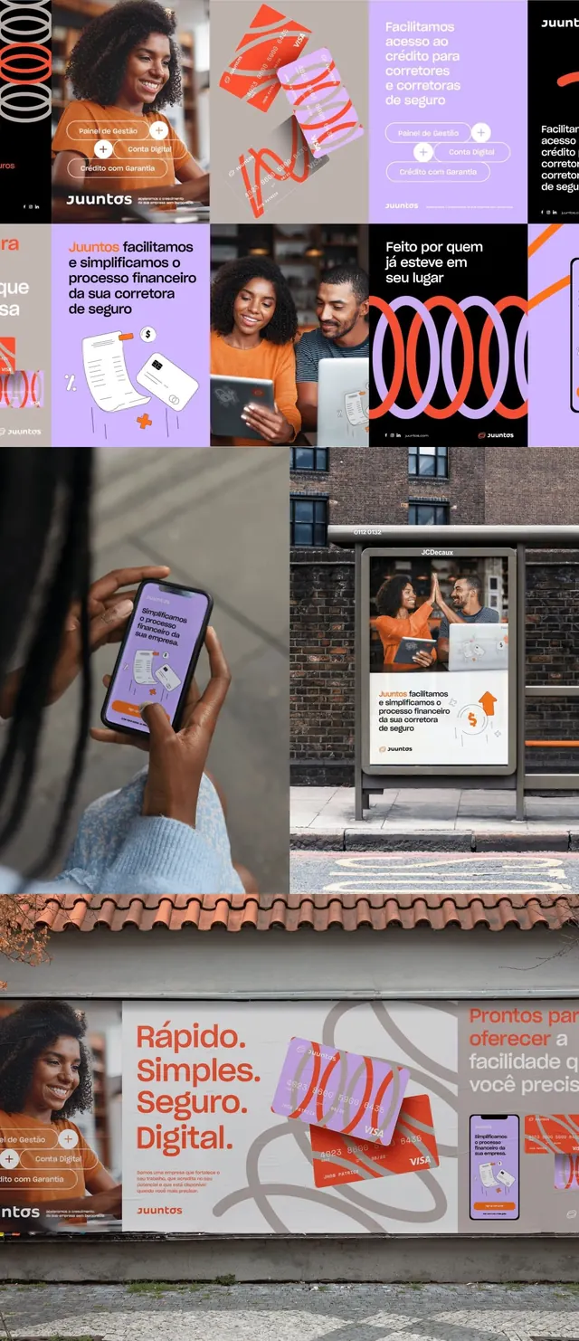
A multi-panel fintech campaign layering orange, purple, and white across portraits, geometric shapes, typography stencils, mobile mockups, and outdoor signage to communicate accessibility and trust.
Summary
A cohesive fintech/insurance brand system using orange and purple as primary identifiers, deployed across portraits, geometric abstraction, digital mockups, and street-level signage to convey simplicity and security.
Visual description
Nine-panel mosaic mixing soft-purple, orange, and white. Top row: portrait of woman in orange shirt, geometric line patterns and shapes, purple card mockup with text. Middle row: bold orange and white geometric stencils, two-person portrait with overlay graphics, mobile phone UI mockup in purple and white. Bottom row: outdoor storefront signage with layered type and graphics, abstract geometric shapes, repeated brand pattern. Sans-serif typography throughout in white and dark. Portuguese language text visible ("Rápido. Simples. Seguro. Digital").
Key takeaway
The restricted three-color palette (orange, purple, white) unified across media from print to digital to environmental. Clean geometric overlays that echo the typography weight without competing with photography. The staggered grid of mixed content types (portraits, abstraction, UI, signage) demonstrates a complete brand system cohesively.
Reuse notes
Ideal for fintech, insurance, or accessibility-focused digital services brands. The warm-cool color contrast reads friendly yet professional. Requires clean portrait photography and clear typographic hierarchy. The outdoor signage mockup shows the system's scale flexibility. Works best when deployed consistently across all touchpoints.
More like this





Keep what you find
A free account saves references to boards and can send you a weekly email of picks based on what you save.
To see every result, go Pro.