Preview image. Unlock full-res
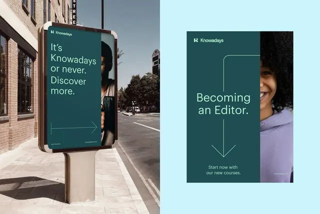
Educational platform brand identity combining teal corporate signage (outdoor) with light cyan digital graphics (paired course landing), unified by teal wordmark and split-screen composition.
Summary
Knowadays course marketing platform shown in dual context: outdoor street signage with tagline, and paired digital landing page for "Becoming an Editor" course with instructor headshot.
Visual description
Left: outdoor metal-framed billboard poster mounted on sidewalk in front of brick building. Wordmark "Knowadays" in white on deep teal background, tagline "It's Knowadays or never. Discover more." in white sans-serif, with a cropped portrait photograph of instructor (dark skin tone) and a thin white arrow pointing right. Right: digital course page on light cyan background. "Knowadays" wordmark (teal), headline "Becoming an Editor." in white sans-serif, thin white arrow guide, body copy "Start now with our new courses." in smaller white text, paired with same instructor portrait. Both layouts use consistent teal as primary brand color, consistent Knowadays wordmark, and consistent portrait photography. Minimalist sans-serif typography in white throughout.
Key takeaway
The teal-and-cyan brand system creating visual harmony between outdoor and digital contexts. The thin white arrow as wayfinding element connecting signage to next step (left-to-right in physical space, visual hierarchy in digital). The instructor portrait humanizing course marketing without being overly illustrative. The condensed, clean sans-serif maintaining legibility at both billboard and screen scales.
Reuse notes
Strong template for educational platforms with in-person and digital touchpoints. The split-screen composition works for comparing contexts, formats, or audience segments. The teal plus light cyan palette reads as trustworthy and modern without being cold. Instructor photography adds personality while keeping the design minimal. Use this layout for multi-channel onboarding campaigns or course series announcements.
More like this




Keep what you find
A free account saves references to boards and can send you a weekly email of picks based on what you save.
To see every result, go Pro.