Preview image. Unlock full-res
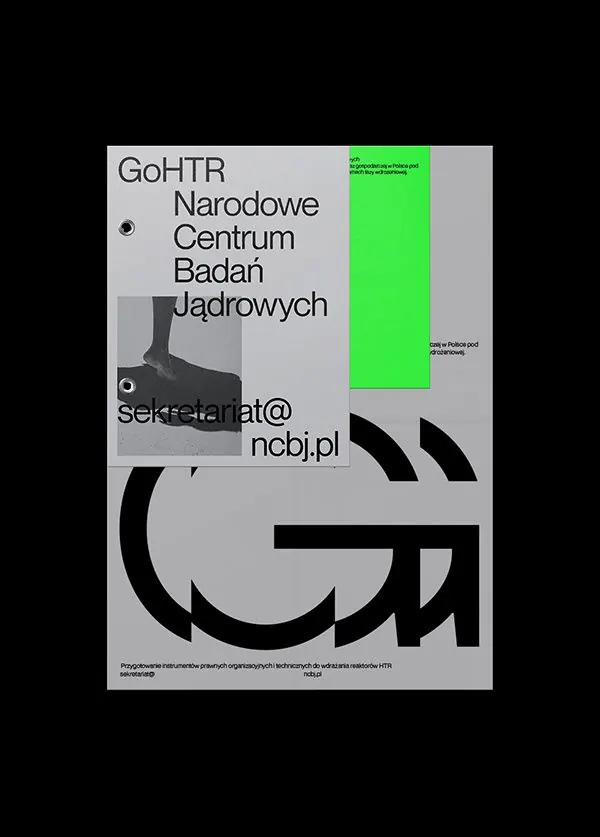
Institutional typographic poster for a Polish nuclear research center, employing stark minimalism with lime green accent to signal authority and scientific rigor.
Summary
A high-contrast institutional poster for GoHTR, a Polish nuclear research center, using stark typography and a neon lime green accent block to convey scientific authority and precision.
Visual description
A light gray background holds a vertical poster layout anchored by large, bold sans-serif display type reading "GoHTR Narodowe Centrum Badan Jadrowych" (National Nuclear Research Center). A grayscale photograph of atomic/scientific imagery sits beneath the headline. On the right, a bright lime green rectangle serves as an accent panel, containing small white text and infotext. Large bold black geometric forms—curved brackets and quotation-mark-like shapes—occupy the lower third, creating a strong visual base. Email contact information in small monospace type sits mid-left. The entire composition prioritizes contrast, legibility, and the authoritative presence of minimal sans-serif typography against negative space.
Key takeaway
The dramatic neon green accent against grayscale is used sparingly but commands attention; the large bold geometric forms ground the composition without competing with text; the combination of large display type and small monospace copy creates a clear hierarchy that reads as both governmental and contemporary.
Reuse notes
Excellent reference for institutional, research, government, or technical branding that needs to convey seriousness and credibility. The neon accent strategy works for organizations needing to appear both traditional and forward-thinking. Best paired with clean, functional layouts and minimal illustration. The high contrast approach is highly legible at small sizes and in print.
More like this


Keep what you find
A free account saves references to boards and can send you a weekly email of picks based on what you save.
To see every result, go Pro.