Preview image. Unlock full-res
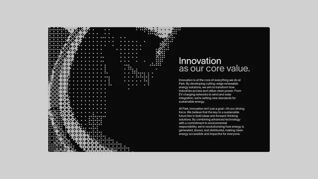
Minimalist corporate layout coupling pixelated world geography on the left with right-aligned headline and multi-paragraph description of Park's renewable energy innovation mission.
Summary
Park renewable energy brand statement pairing a pixelated world map graphic on the left with white display type reading "Innovation as our core value" and body copy detailing sustainable energy solutions.
Visual description
A horizontal rectangular composition with a dark charcoal background split into two halves. The left half features a monochromatic pixelated or halftone-rendered world map in grayscale, with densities varying from solid black through gray to white, creating an abstract topographic quality. The right half contains white sans-serif typography: a large, bold display headline reading "Innovation as our core value." Below sits justified body copy in a regular weight describing Park's renewable energy mission, covering cutting-edge solutions, environmental responsibility, and sustainable energy standards. The typography is meticulously aligned and uses hierarchical sizing to distinguish headline from descriptive text.
Key takeaway
The pixelated map as a background pattern reinforces the technology/innovation positioning without overwhelming the text; the clean black-white contrast and generous negative space convey premium corporate credibility; the split-frame composition balances visual interest (map) with messaging clarity (text block).
Reuse notes
Ideal for B2B energy, sustainability, or technology brands explaining core mission. The minimalist approach suits executive presentations, annual reports, and brand guidelines. The monochromatic treatment emphasizes gravitas and professionalism. Works at medium to large display sizes; ensure sufficient contrast at smaller scales.
More like this




Keep what you find
A free account saves references to boards and can send you a weekly email of picks based on what you save.
To see every result, go Pro.