Preview image. Unlock full-res
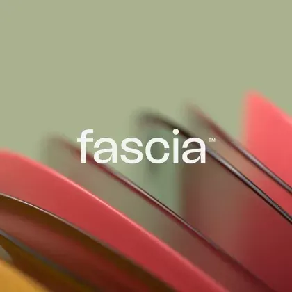
Minimalist wordmark centered on soft, blurred organic shapes in warm earth tones, suggesting layers of fabric, leaves, or brushstrokes.
Summary
A wordmark for "fascia" positioned over soft, layered organic forms in warm muted earth tones, creating a sophisticated, tactile brand identity.
Visual description
Soft, blurred organic shapes in graduated warm tones (sage green at top fading through rust, burgundy, and taupe) suggest overlapping layers of fabric, plant forms, or gestural brushstrokes. The shapes blur and overlap creating depth without sharp edges. The white sans-serif wordmark "fascia" with a trademark symbol sits centered and unadorned, letting the abstract background communicate the brand's organic, wellness-forward aesthetic. The composition balances minimalist typography with rich, earthy visual texture.
Key takeaway
Pairing clean, contemporary type with blurred, tactile abstraction creates a premium wellness aesthetic that feels both modern and natural. The muted warm palette avoids cliche spa-branding while staying approachable. The soft-focus background doesn't compete with the wordmark but enhances it.
Reuse notes
Perfect for brands in wellness, beauty, skincare, or lifestyle sectors seeking sophistication over loudness. Works well on packaging, digital backgrounds, and stationery where texture matters. The blurred forms also compress well at small scales due to their soft edges.
More like this





Keep what you find
A free account saves references to boards and can send you a weekly email of picks based on what you save.
To see every result, go Pro.