Preview image. Unlock full-res
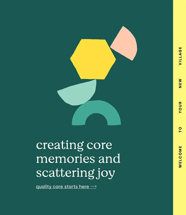
Branding for a memory care community using stacked geometric shapes in warm pastels against teal, with human-centered copy and supportive visual language.
Summary
Healthcare branding for a memory care community combining stacked geometric shapes in warm pastels with centered serif copy on a deep teal field, emphasizing joy and belonging.
Visual description
A composition built on a deep teal background holds four stacked organic-geometric shapes in the upper center: a pale pink teardrop, a bright yellow hexagon, a mint green crescent, and a teal arch or semicircle. Below, white serif type (displayed in a traditional serif face) centers the headline "creating core memories and scattering joy" with an underlined call-to-action "quality care starts here" with a right arrow. A bright yellow vertical stripe on the right edge carries vertical text (likely branding or tagline copy). The overall spatial treatment is balanced and symmetrical, with generous breathing room around the central mark.
Key takeaway
The stacked, building-block approach to an abstract mark creates visual warmth and approachability without resorting to literal imagery. The color palette—soft yellows, pinks, and greens against a steadying teal—conveys both comfort and professionalism. The serif headline (set at human scale) reinforces emotional resonance and legacy, while the accent stripe and bold yellow create visual structure. The copy itself ("creating core memories," "scattering joy") is woven into the design, not layered over it.
Reuse notes
Ideal for senior care, hospice, wellness, or community-oriented healthcare organizations. The warm, approachable palette and organic mark language work well on digital and print touchpoints. The teal background provides strong contrast for legibility. Avoid using on cluttered backgrounds; the design needs breathing room to land. The humanistic tone pairs well with storytelling-focused marketing. The yellow stripe offers a flexible accent for modular layouts.
More like this







Keep what you find
A free account saves references to boards and can send you a weekly email of picks based on what you save.
To see every result, go Pro.