Preview image. Unlock full-res
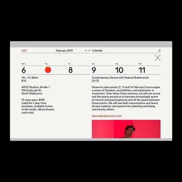
Weekly calendar view with stark contrast between neutral list information and a neon-pink event image, separated by a strong vertical divider.
Summary
Weekly calendar view with stark contrast between neutral list information and a neon-pink event image, separated by a strong vertical divider.
Visual description
A two-column event listing for February 2019 combines logistics and promotion. The left column, rendered in black text on off-white, lists event details: weekday numbers (6, 8, 9, 10, 11) paired with a red circular marker on Thursday, time slots (10-11:30am), pricing ($15), and venue information (WXYZ Studios, North Melbourne) in a tight, organized sans-serif face. The right column flips the palette: neon-pink background with black and white copy describing a contemporary dance class, its philosophy, and instructor bio. Below, a portrait photograph of the instructor is cropped aggressively into the pink zone. A clean white vertical line separates the columns, enforcing the contrast between information and image.
Key takeaway
The vertical divider as a tool for separating functional information from promotional imagery—it creates rhythm and prevents visual overwhelm. The restraint of the left column (just type on white) makes the neon-pink right side feel like an earned accent rather than visual noise. Using a single bold accent color (neon pink) over large areas creates drama without needing multiple colors.
Reuse notes
Ideal for event websites, class schedules, or editorial layouts where practical details need to coexist with inspirational imagery. The neon pink works best for cultural/arts venues. For conservative industries, swap the accent color to a muted tone but keep the stark left-right divide.
More like this





Keep what you find
A free account saves references to boards and can send you a weekly email of picks based on what you save.
To see every result, go Pro.