Preview image. Unlock full-res
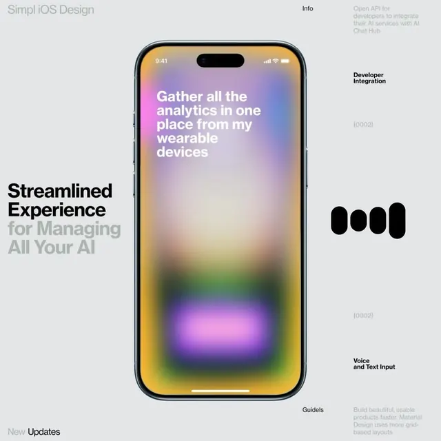
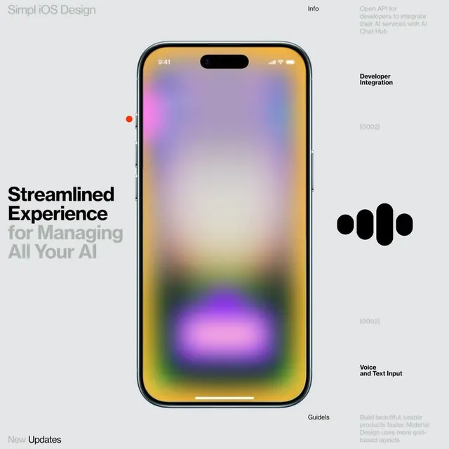
An iPhone mockup displaying a gradient interface transitioning from warm yellows to cool purples, labeled for AI chat integration with supporting UI annotations.
Summary
An iPhone mockup showcasing a soft radial gradient screen transitioning from warm peachy-yellow at the top through purple, magenta, and blue-green tones, flanked by product labels and capability annotations for an AI chat integration service.
Visual description
Centered iPhone 14-style mockup displaying a full-screen gradient with no visible UI controls. The gradient radiates from a warm peachy-yellow-orange at the top, blending through soft lavender and magenta in the middle, to cool blue-green accents at the bottom. The background is a muted light gray. To the left of the phone is left-aligned black text reading "Streamlined Experience" in a bold display font, with gray subtext, plus a red dot accent. To the right are multiple annotation sections in smaller sans-serif text: a header "Developer Integration" with a code icon, sections labeled "Voice and Text Input" and "Guidels" with explanatory copy in light gray. The overall impression is a pitch-deck or concept slide for an AI platform.
Key takeaway
Radial gradients with warm-to-cool color transition convey innovation and approachability simultaneously, avoiding either sterile corporate coldness or juvenile playfulness. Asymmetric text placement (dense left side, distributed right side) creates visual interest without clutter. The gradient itself as the primary content (no UI chrome) emphasizes the experience concept over implementation detail, useful for pitches.
Reuse notes
Ideal for SaaS or AI product presentations, developer tool landing pages, and product pitch decks where the visual aesthetic must signal both warmth and technical credibility. The gradient works best at this scale and aspect ratio; smaller contexts may lose the color transition nuance. Pairs well with minimalist sans-serif type and generous whitespace. The annotation layout is effective for feature storytelling on product pages.