Preview image. Unlock full-res
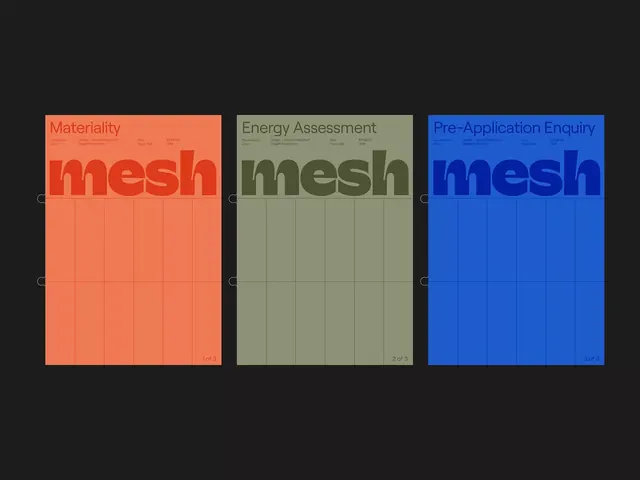
Three vertical service cards for a consulting or environmental firm called Mesh, each in a distinct color (coral, olive, blue) with oversized logotype and grid structure.
Summary
Three full-height service cards for Mesh, each labeled with a different offering (Materiality, Energy Assessment, Pre-Application Enquiry), using a bold triadic color system and oversized logotype anchoring.
Visual description
Three vertical cards arranged horizontally, filling the frame equally. Each has a small header with a label and secondary text in a compact sans-serif, plus the brand name "mesh" in the top-left corner. The left card is coral-orange with the title "Materiality" and a large semi-transparent oversized "mesh" word occupying the center. A regular grid of small coral squares subdivides the lower half. The center card is muted olive-green with "Energy Assessment" as the header and an identically oversized, semi-transparent "mesh" logotype, again with grid squares in a slightly darker olive tone. The right card is bright royal blue with "Pre-Application Enquiry" and the same structural treatment. Small pagination numbers (1 of 3, 2 of 3, 3 of 3) appear at the bottom-right of each card. All three share identical typography hierarchy and grid structure, differing only in hue.
Key takeaway
The triadic color system creating strong visual distinctiveness while maintaining unity through identical structure and typography. Each color is applied systematically across the entire card, avoiding two-tone splits. The oversized, semi-transparent logotype becomes a brand anchor that unifies disparate service offerings. The grid structure at the bottom adds visual weight and suggests organization or data management. The numbered pagination footer makes each service feel like part of a navigable system.
Reuse notes
Perfect for consulting, professional services, or environmental/sustainability brands offering multiple service tiers. Works especially well when you need to present three complementary or sequential services. The color blocking strategy removes decision fatigue by assigning each option its own decisive hue. The grid pattern pairs well with corporate-clean aesthetics and reads as organized and data-driven. Avoid using if color-coding is meaningless; ensure each color represents actual hierarchy or categorization.
More like this






Keep what you find
A free account saves references to boards and can send you a weekly email of picks based on what you save.
To see every result, go Pro.