Preview image. Unlock full-res
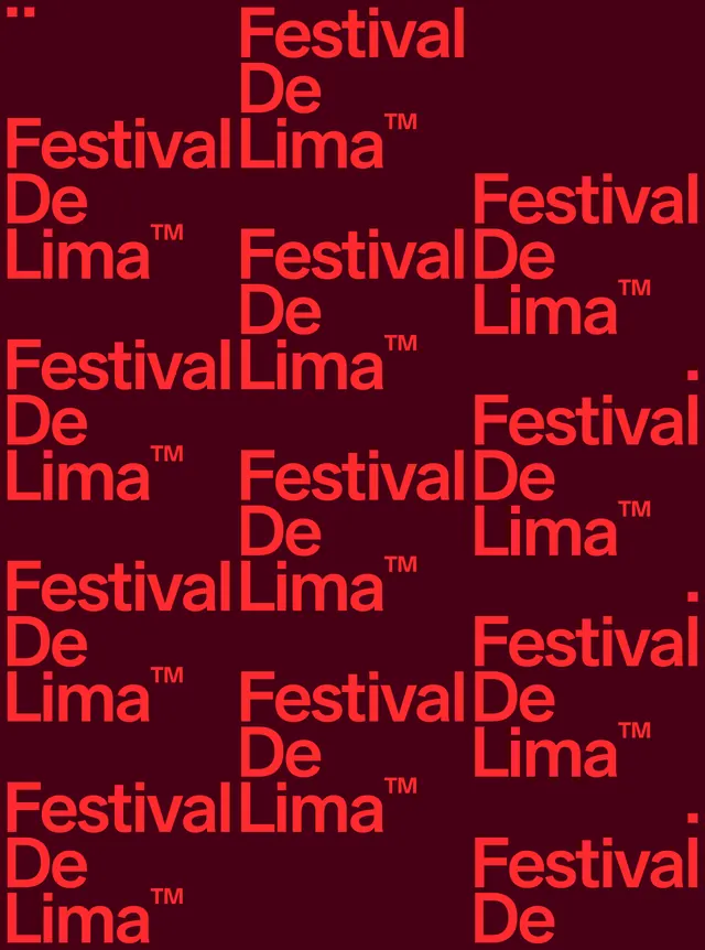
Dense typographic grid pattern of brand name and trademark repeated across a deep maroon background in bright orange-red sans-serif.
Summary
Dense typographic grid pattern of brand name and trademark repeated across a deep maroon background in bright orange-red sans-serif display type.
Visual description
The phrase "Festival De Lima" with a trademark symbol fills the entire frame in a tight, regular grid. Each instance is set in a bold, clean sans-serif with generous weight and tracking, rendered in bright orange-red against a deep maroon field. The repetition is mechanical and uniform, covering the canvas edge-to-edge with no breathing room. The wordmark breaks across lines without regard to meaning, sometimes split between rows, creating a pattern texture rather than legible copy. The color contrast is maximum—the neon orange jumps forward sharply against the dark wine background, creating a vibrant, almost kinetic visual energy. Small red squares and marks in the top-left and right edges suggest branding mark applications or pattern extensions.
Key takeaway
Repeating a single wordmark densely across a canvas creates an unmistakable, ownable brand pattern. The high-saturation orange-red against deep maroon is an unusual and memorable color combination that reads as festive and celebratory. Using type itself as a pattern device (rather than a separate graphic) is economical and reinforces brand recall through repetition.
Reuse notes
Perfect for event merchandise, posters, or promotional materials where the goal is brand saturation and visual impact. The pattern works well at small scale (business cards, stickers) and large scale (murals, banners) without needing to redesign. Only works with high-contrast color pairs; softer or desaturated combinations will feel muddy or illegible. Best suited for cultural events, festivals, or youth-oriented brands.
More like this




Keep what you find
A free account saves references to boards and can send you a weekly email of picks based on what you save.
To see every result, go Pro.