Preview image. Unlock full-res
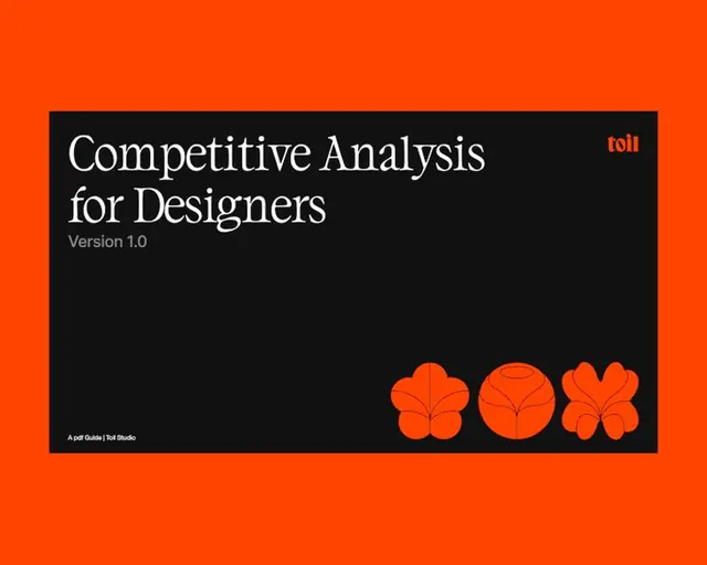
A high-contrast type specimen cover featuring bold serif display type on a black rectangle centered within a vibrant orange field, with abstract geometric shapes in the corner.
Summary
A guide cover using high-contrast serif typography and abstract floral geometric shapes, set against vibrant orange and black to signal seriousness and visual command.
Visual description
A bright orange background field frames a large black rectangle in the center, taking up roughly 60% of the space. Inside the black box, white serif display type reads "Competitive Analysis for Designers" with a smaller gray sans-serif line "Version 1.0" underneath. The top right corner of the black box shows a small orange "toll" text label. Lower left displays small attribution text "A pdf Guide | Toll Studio". The orange perimeter around the black box exposes abstract geometric shapes in the bottom right: three organic rounded/floral circular and petal-like forms with line-work, rendered in the same orange as the field. The stark composition relies on typography weight and color contrast rather than imagery.
Key takeaway
The frame-within-frame—a black box acting as the primary content container creates visual separation and focus, while the exposed corners let the accent color (orange) and geometric accent shapes reinforce brand personality. Large serif display type commands attention; pairing it with a subtle version number and small credit line in the footer creates a structured, documented feel. The geometric shapes are economical: three elements in a corner provide visual richness without clutter.
Reuse notes
Excellent for design resource guides, competitive analysis documents, or B2B reports targeting designers. The high-contrast palette (orange and black) is forceful and suits analytical or consulting positioning. Serif display type signals authority; swap it for sans-serif to shift toward tech or startup. The corner geometric element pattern is adaptable to any brand shape language.
More like this



Keep what you find
A free account saves references to boards and can send you a weekly email of picks based on what you save.
To see every result, go Pro.