Preview image. Unlock full-res
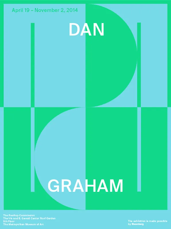
Rooftop Commission exhibition poster split into light and dark quadrants by an overlaid bright cyan and green geometric grid with two artist names in display type.
Summary
A vertical exhibition poster for The Rooftop Commission splitting the canvas into quadrants using an overlaid cyan-to-green grid that organizes two artist names in large sans-serif display type.
Visual description
The poster is divided into four equal quadrants by thin white lines (a grid), with alternating light cyan and bright green background colors. The top and bottom right quadrants are light cyan; the top and bottom left are bright emerald green. Large white sans-serif capitals spell "DAN" in the top half and "GRAHAM" in the bottom half, each sitting on the cyan sections. Curved shapes in contrasting colors arc across the center dividing lines, creating fluid transitions between the rigid grid. The date range "April 19 - November 2, 2014" appears in the top-left corner in small type. At the bottom, text credits the Rooftop Commission and venue information in minimal sans-serif.
Key takeaway
The grid as a compositional armature that lets oversized type sit cleanly while curved geometric shapes soften the rigid layout. The two-color flip (light and dark quadrants) creates visual rhythm without additional colors. The interplay of straight lines and curves makes the poster feel both orderly and organic.
Reuse notes
Strong for exhibition or publication promotion where two names or concepts need equal weight. Works best with a tightly limited palette (two to three colors). The grid structure is readable at small scale and stands out as distinctly typographic without relying on imagery.
More like this

Keep what you find
A free account saves references to boards and can send you a weekly email of picks based on what you save.
To see every result, go Pro.