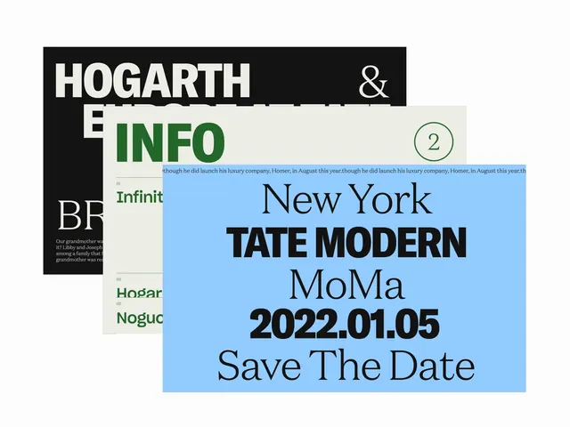
Preview image. Unlock full-res
Layered typographic announcement with stark black bands and light blue grounds, bold display sans-serif, and museum-event formatting for the Tate Modern.
Summary
Institutional event announcement layering black and light blue typographic bands with a museum date, featuring oversized display sans-serif and a stark two-color palette.
Visual description
A collaged composition of three overlapping design pieces in a single frame. On the upper left, a black background with white sans-serif type reads "HOGARTH & INFO" and "BF" (partial text visible). The main event card occupies the center-right: a light blue ground with dark serif and sans-serif type arranged vertically reading "New York", "TATE MODERN", "MoMA" (institutional names), the date "2022.01.05" in bold sans-serif, and "Save The Date" in a lighter serif below. A cream or pale gray band appears on the left edge of the announcement, containing green text and additional institutional information (partially visible). The composition creates visual hierarchy through layering, color contrast, and typographic scale variation. All type appears to be museum-standard geometric or humanist sans-serif paired with traditional serif for body text.
Key takeaway
The stark black-and-light-blue contrast creates instant visual impact and institutional authority. Layering overlapping information fields on different colored grounds guides the eye and establishes clear information hierarchy without explicit borders or frames. The date formatting (YYYY.MM.DD) and "Save The Date" formula is direct and memorable for institutional promotion.
Reuse notes
Strong model for cultural-institution announcements, gallery events, and formal museum communications. The high-contrast palette and typographic emphasis work well for posters, digital announcements, and email campaigns. Best suited to professional, academic, or nonprofit contexts where formality and clarity are priorities. The color palette (black, light blue, cream) is versatile and accessible.
More like this



Keep what you find
A free account saves references to boards and can send you a weekly email of picks based on what you save.
To see every result, go Pro.