Preview image. Unlock full-res
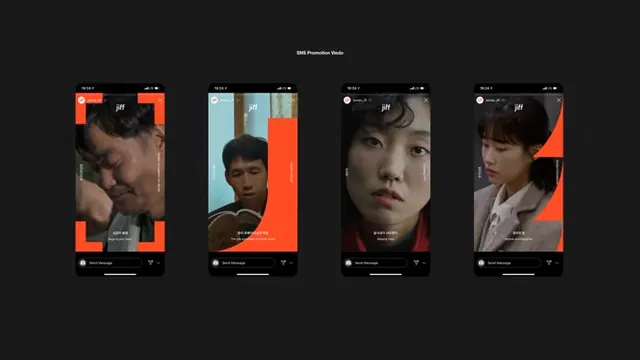
Four dark mobile app screens with vibrant orange corner brackets framing portrait photography and minimal white typography.
Summary
Four dark mobile app screens framed with vibrant orange corner brackets, each featuring a close portrait photograph and minimal white typography below.
Visual description
Each of four smartphone screens sits on a dark background and is bounded by a thick bright-orange L-shaped bracket in the top-left and bottom-right corners. The phone bodies are black with status bars and minimal UI chrome. Each screen displays a full-bleed portrait photograph (close-up faces, half-lit) with white sans-serif text overlaid at the bottom (2-3 lines, left-aligned). The "pfr" logo in white sits top-left. The overall composition is a clean 2x2-style grid. The orange geometric frame draws the eye and creates strong visual rhythm.
Key takeaway
The corner-bracket framing technique creates a distinct visual container without obscuring content. The vibrant warm accent against dark background maximizes contrast and draws focus. The restraint in typography (white, left-aligned, minimal) lets photography dominate.
Reuse notes
Strong for editorial mobile app showcases or lifestyle/portrait-focused brands. The dark background and orange pop work well for high-end consumer apps, fashion, media, or entertainment properties. Avoid if the imagery needs a neutral backdrop.
More like this



Keep what you find
A free account saves references to boards and can send you a weekly email of picks based on what you save.
To see every result, go Pro.