Preview image. Unlock full-res
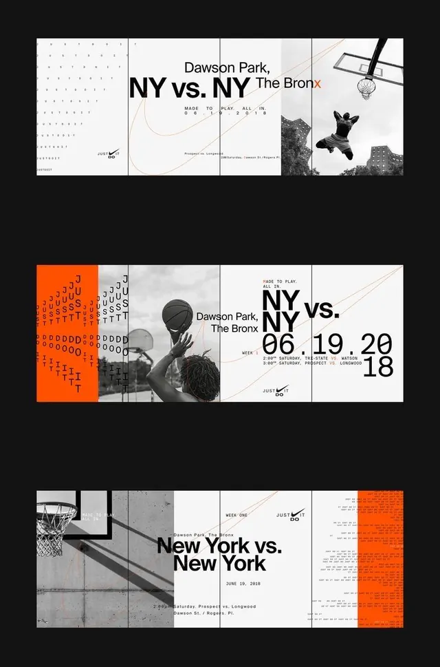
Multi-layout event poster set for basketball competitions mixing monochrome photography with a single orange accent panel and bold sans-serif headlines.
Summary
Multi-layout event poster set for basketball competitions mixing monochrome photography with a single orange accent panel and bold sans-serif headlines.
Visual description
Three poster variations arranged horizontally, each showing basketball event information for "NY vs. NY" at Dawson Park, The Bronx. Each layout integrates monochrome sport photography (hoop detail, player with ball, basketball net) with white text panels, fine line drawings in soft coral, and event details (dates, times, location). The leftmost layout features a dense dot pattern background; the center emphasizes large bold "NY vs. NY" typography split across panels; the right layout adds a bold orange left edge panel filled with repeating letter patterns. Sans-serif headline font in black and white; smaller body text in a clean sans-serif for event details and logistics.
Key takeaway
The orange accent panel strategy on one layout variant creates visual punch without overwhelming the grid. The combination of structural grid, monochrome photography, and minimal accent color (one warm tone) is highly effective for sports promotions. Fine coral line work adds sophistication without competing for attention.
Reuse notes
Strong reference for sports event and competition marketing. Works best when paired with authentic athletic photography. The orange accent is polarizing; test whether a different accent color suits your brand before copying wholesale. Three-panel format suits a print triptych or modular digital campaign.
More like this




Keep what you find
A free account saves references to boards and can send you a weekly email of picks based on what you save.
To see every result, go Pro.