Preview image. Unlock full-res
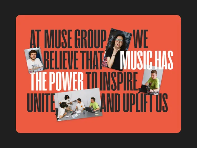
An event poster combining bold orange-red with embedded photography and black typography, conveying music collective identity through layered composition.
Summary
An event poster combining bold orange-red with embedded photography and black typography, conveying music collective identity through layered composition.
Visual description
A vibrant poster with a dominant burnt-orange background contains rectangular cutouts of photographs (people posing, band members, moments of connection) arranged in a grid pattern. Black sans-serif type overlays the composition in heavy, all-caps weight, arranged horizontally across the layout. The photographs are framed without borders, creating negative space against the warm background. The overall effect is energetic and forward-facing, with the typography priority over the imagery, reading as a statement about collective identity and creative power.
Key takeaway
The restraint of a single warm hue as the dominant background color lets photography and typography share equal visual weight without competition. The all-caps type treatment reinforces the assertive tone appropriate to music and movement messaging. Color field backgrounds reduce complexity while framing photographs as discrete, important moments.
Reuse notes
Strong for event and music collective branding, festival promotion, band or artist collective campaigns. Works best with compelling portrait or action photography. Requires careful typography sizing so text reads over and around the embedded photos.
More like this
Keep what you find
A free account saves references to boards and can send you a weekly email of picks based on what you save.
To see every result, go Pro.